Observable Canvases
A collaborative infinite canvas for data analysis and visualization, designed from zero to one.
The challenge
Data analysis tools force linear workflows onto an inherently non-linear process. Observable needed a fundamentally new way for people to think, explore, and communicate with data.
0 → 1
Built from scratch
2-person
Product design team
1 year
Zero to launch
∞
Figma layers
Background
What is Observable?
Observable is a platform for data analysis and visualization. It started as a computational notebook tool for JavaScript and data visualization, and built a dedicated following among data scientists and visualization engineers. By 2025, Observable was looking to expand beyond the notebook paradigm and reach a broader audience of data analysts.
I joined as one of two product designers at a pivotal moment. The team had identified a new direction: a flexible no-code platform for exploring, analyzing and visualizing their data. But our initial prototype looked much like a notebook, linear and constrained, and not inviting to our exploratory analyst persona.
Foundations
Making the case for the canvas
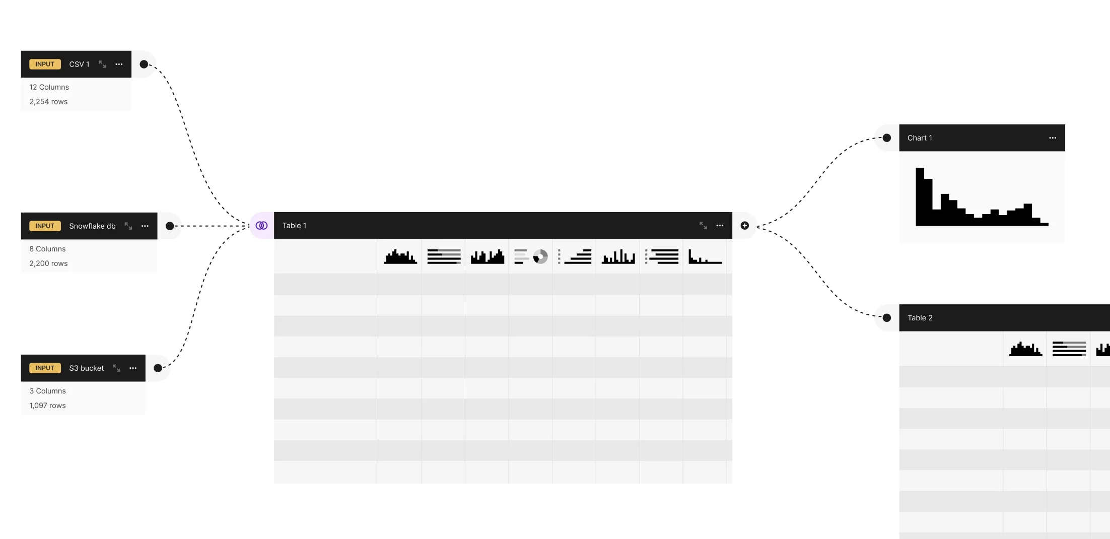
Based on my own experience working as a data analyst, I knew data analysis is messy, non-linear, exploratory, and collaborative. We needed a medium that would encourage this exploration—I imagined an infinite node-based canvas where analysts could be free to duplicate experiments, tweak parameters, and lay out branching workflows with total freedom.
Our initial MVP proved the idea of a connected series of tables where you could directly filter and interact with data, no code required. But it was still linear and constrained.
I zoomed out, imagining how an infinite canvas could better suit the messy, non-linear, exploratory nature of data analysis.
The design team performed competitive research, prototyping, poking and prodding the idea until we were convinced an infinite canvas was the right direction. But this would be a big departure from our previous notebook-based software, so we needed to prove out the concept to the rest of the company.
Defining the system
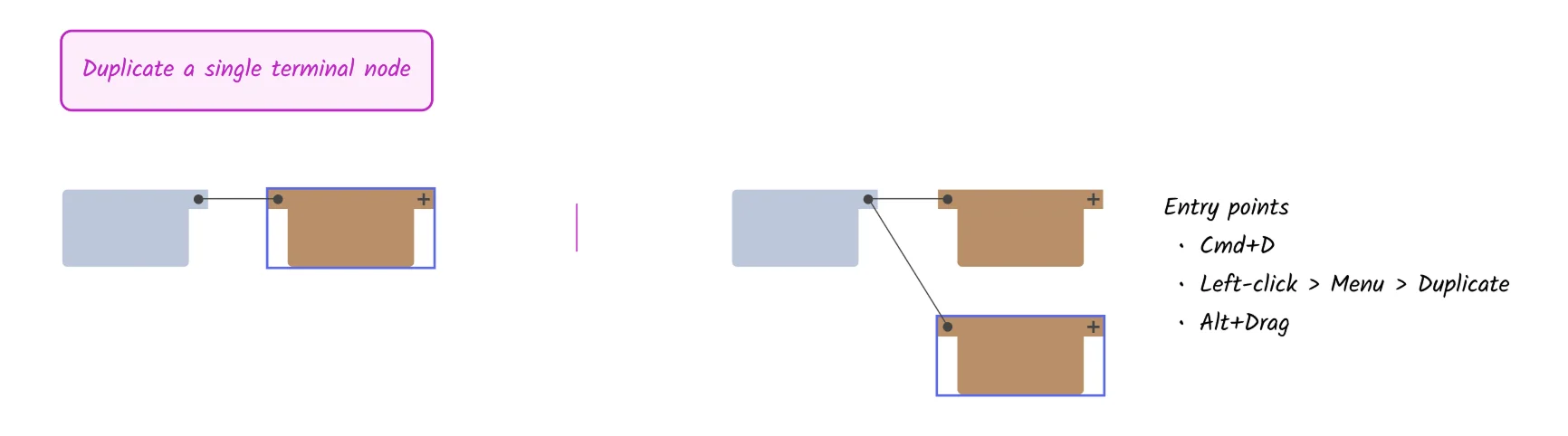
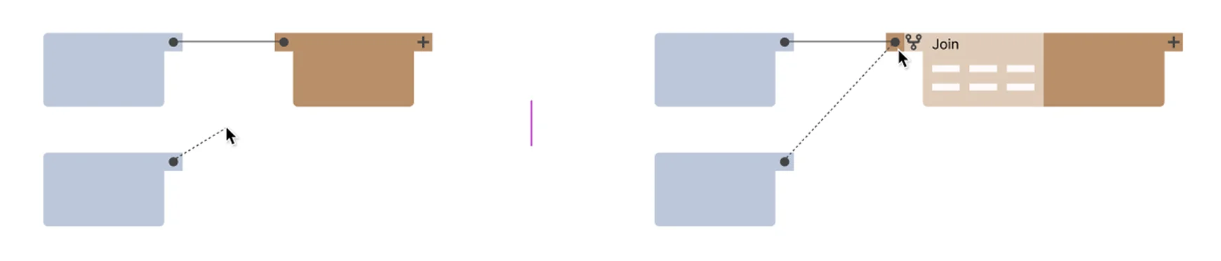
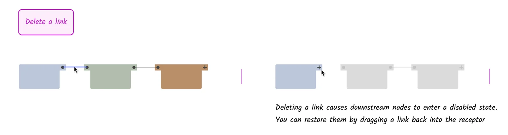
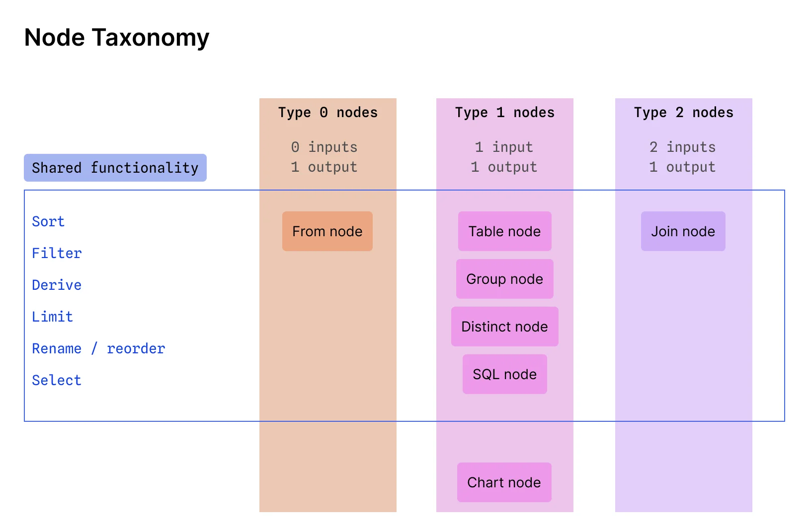
We made the idea concrete by defining the key components and their functionality. We created a taxonomy explaining node types, and created “Lego-style” prototypes demonstrating the core functionality of creating, duplicating, deleting, and joining nodes.
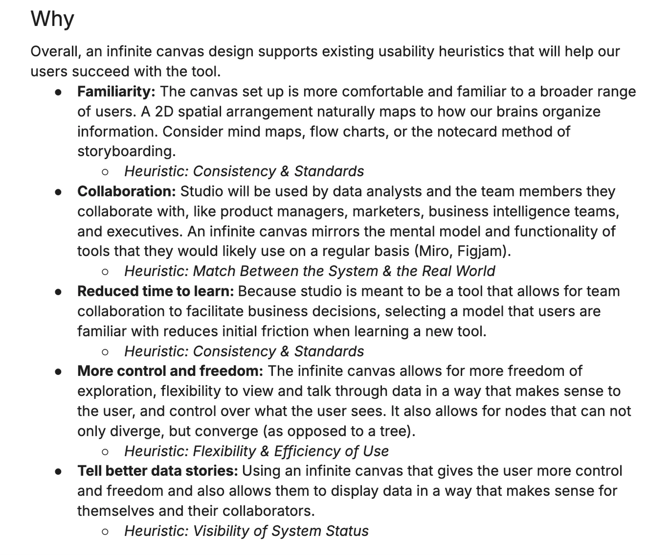
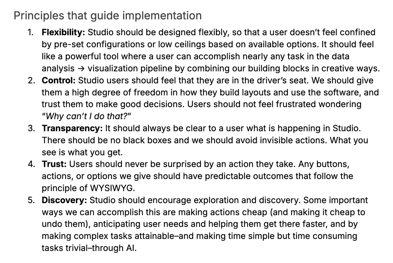
Observable has a strong writing and research culture, so we also created a detailed research and explanation document outlining the design principles, mapping them to usability heuristics, and addressing potential concerns.
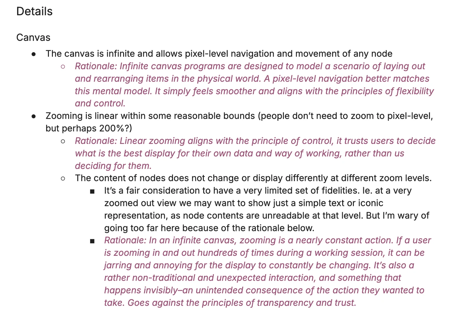
The result? Observable committed to the infinite canvas vision. Our pitch going forward was that the medium itself matches how data analysis actually works: messy, non-linear, and collaborative. By giving analysts the freedom to branch, experiment, and spread their thinking out, you unlock the full potential of your data.
A new design system
A clean slate
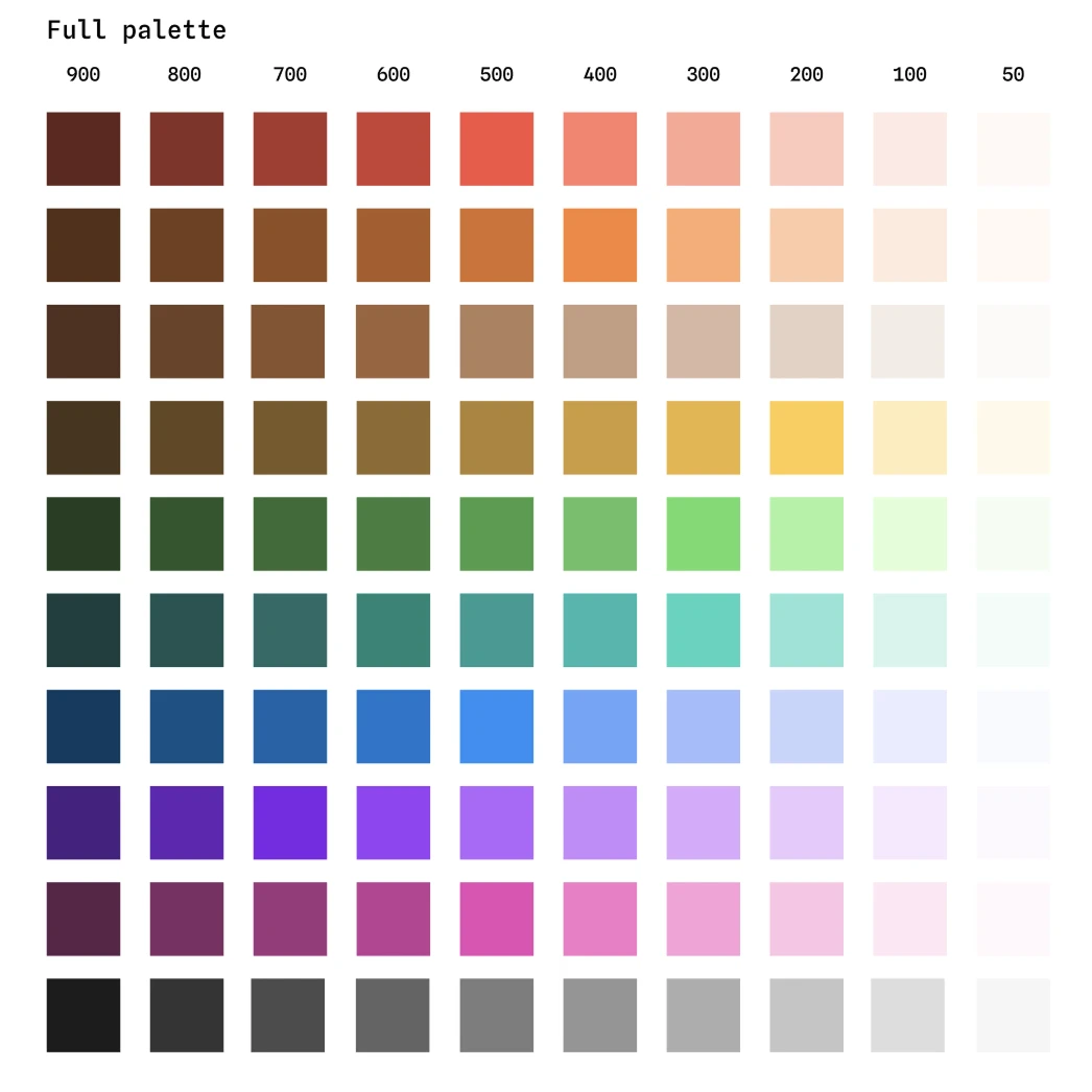
A new product gave us a clean slate to rethink our design system. We knew Canvases would incorporate highly complex UIs, dense displays, and that our UI would be complementing data visualizations throughout the canvas. So we needed something that would be light, airy, high-contrast, and hardworking.
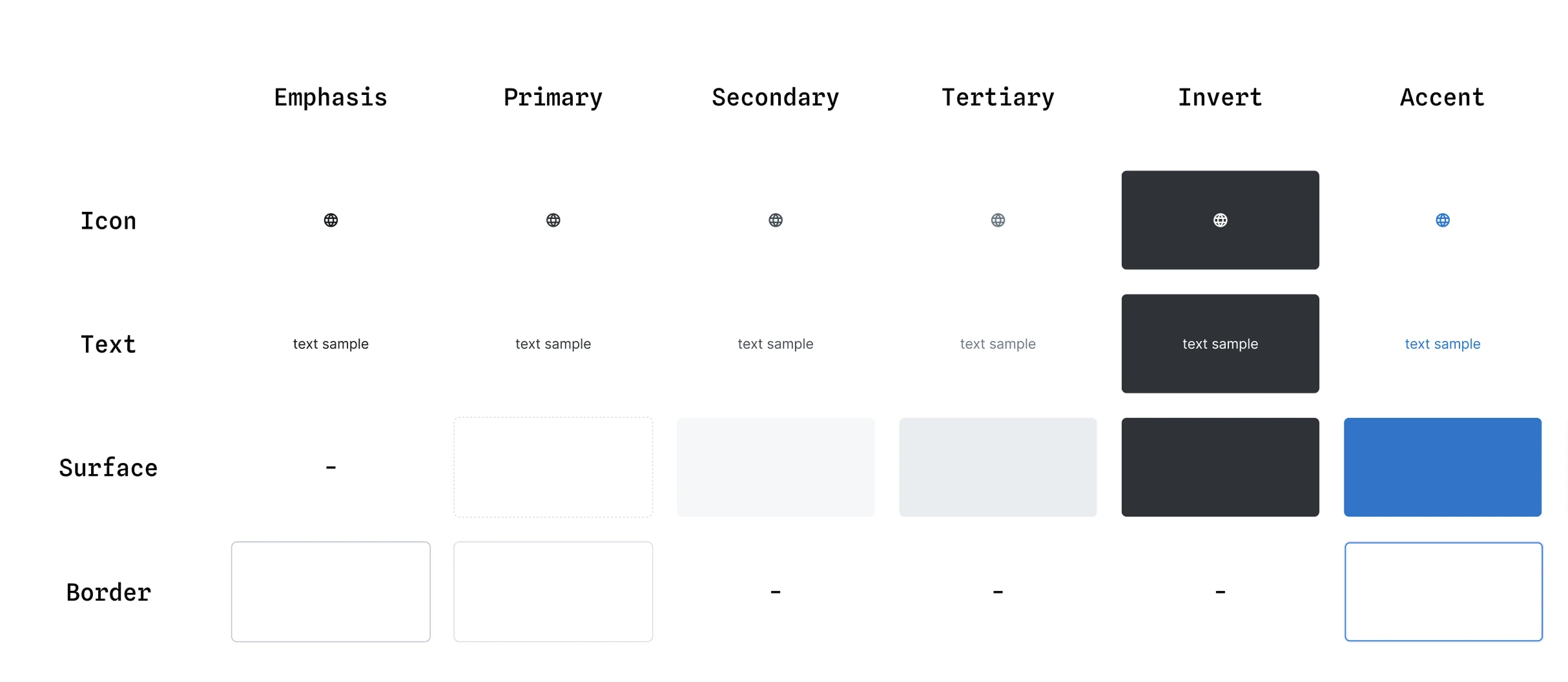
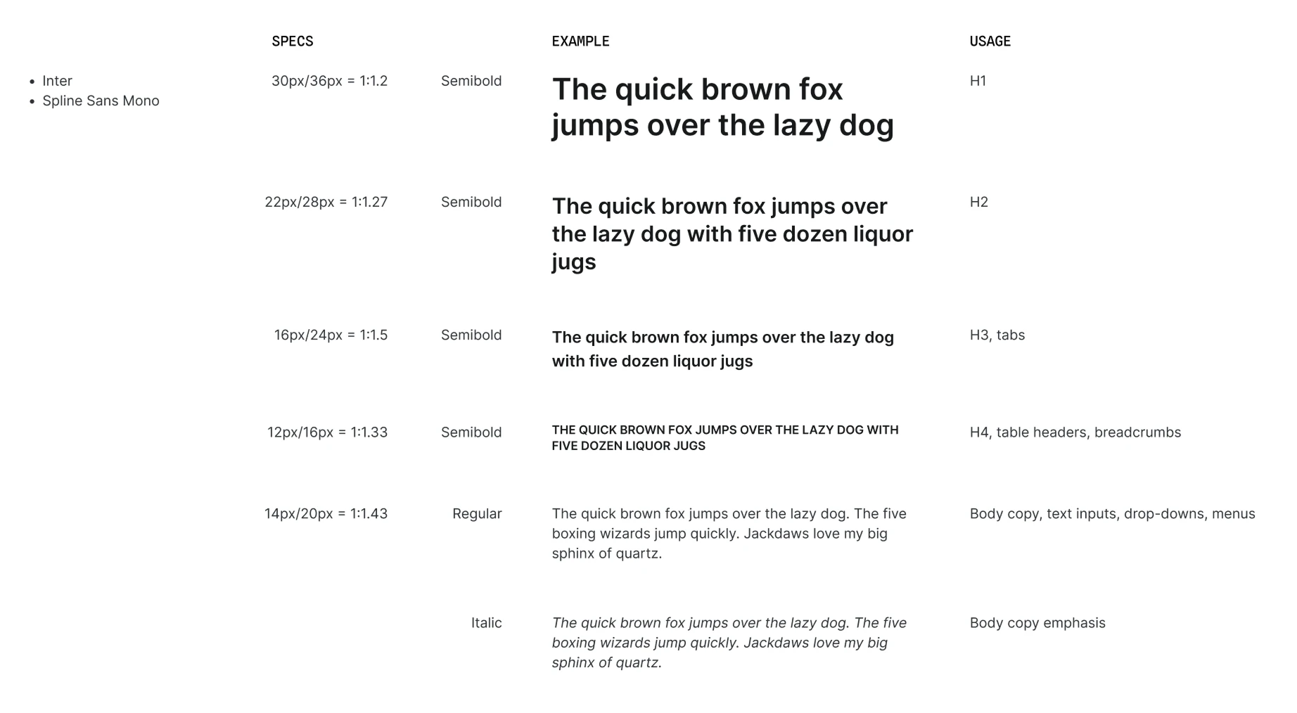
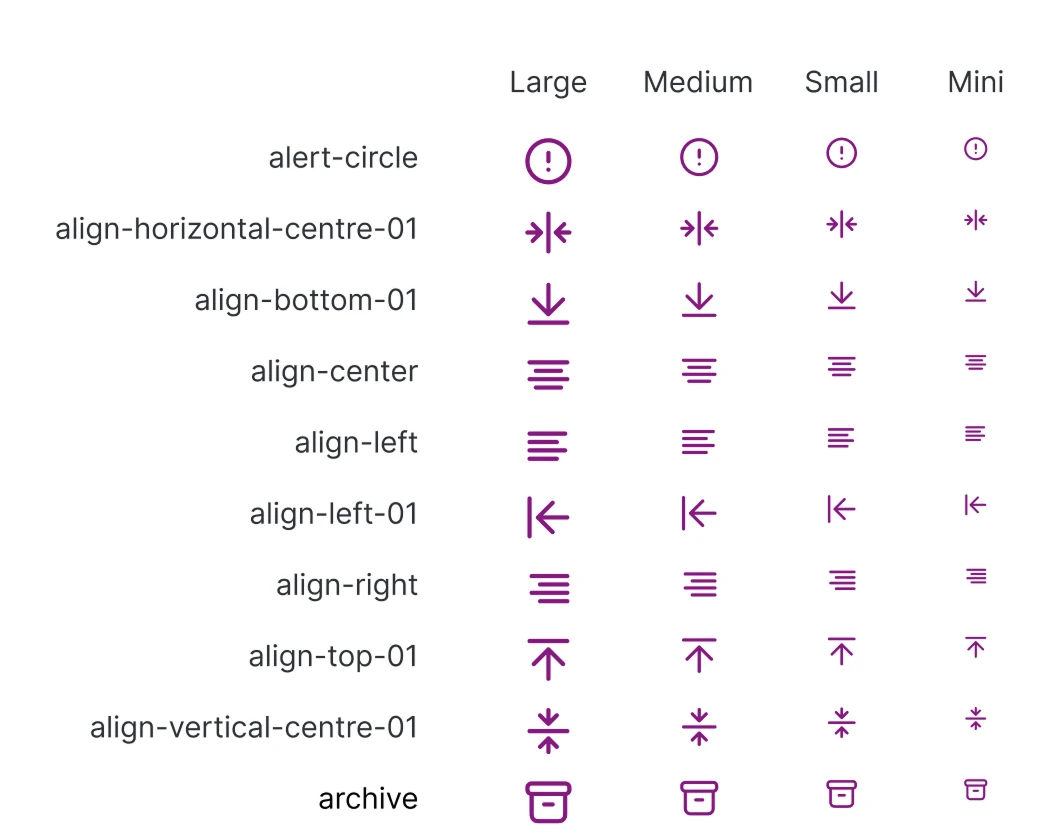
We developed a bold and flexible color system that considered both UI needs and data visualization, a typography scale that felt minimal to reduce visual noise in dense displays, and a new icon library that replaced our previous chunky icons with lighter versions that worked at multiple scales. We also created an entirely new UI component library, where I introduced small versions of all of our components to accommodate the more dense displays of this new product.
Drawing the rest of the owl
Designing the node
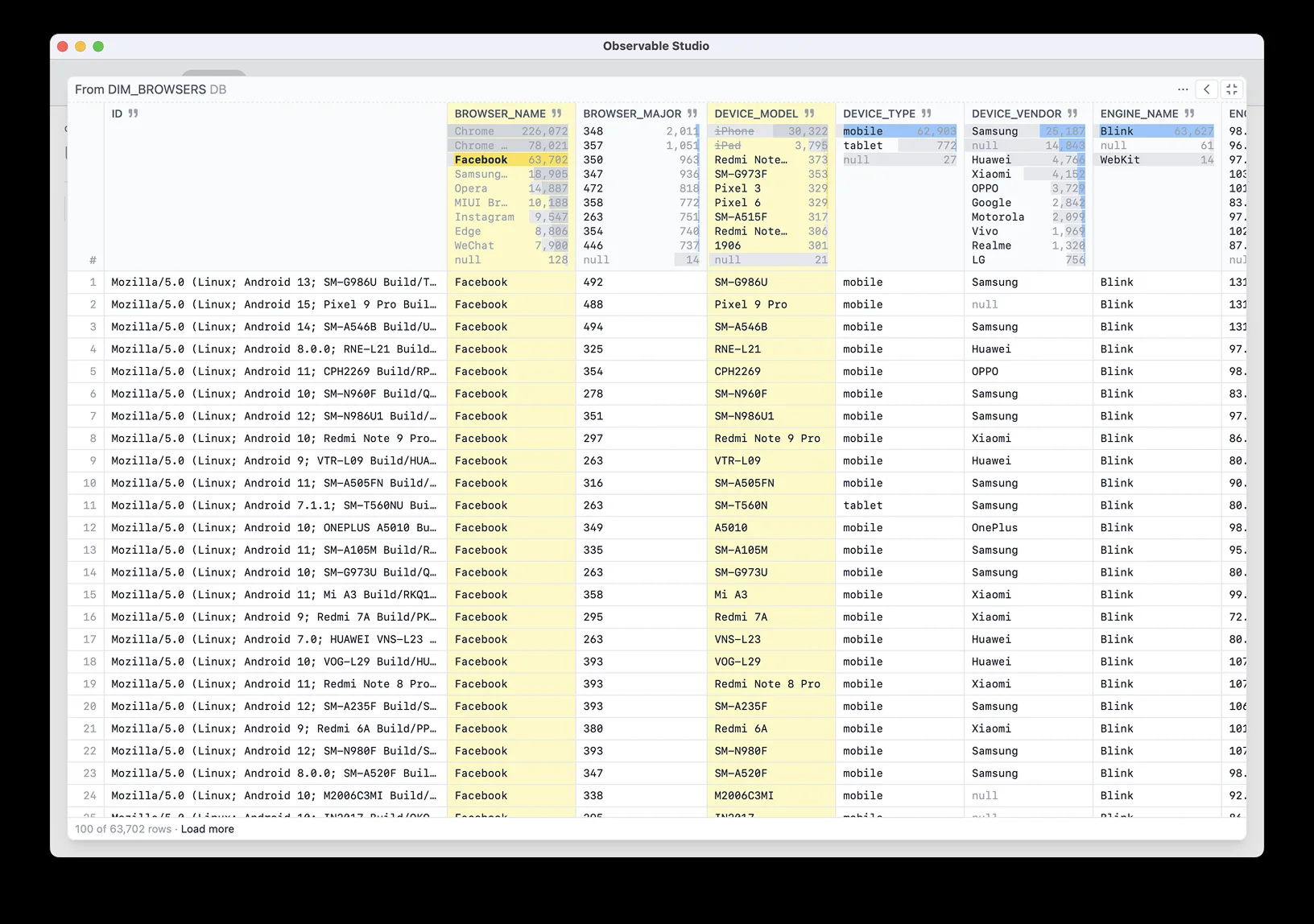
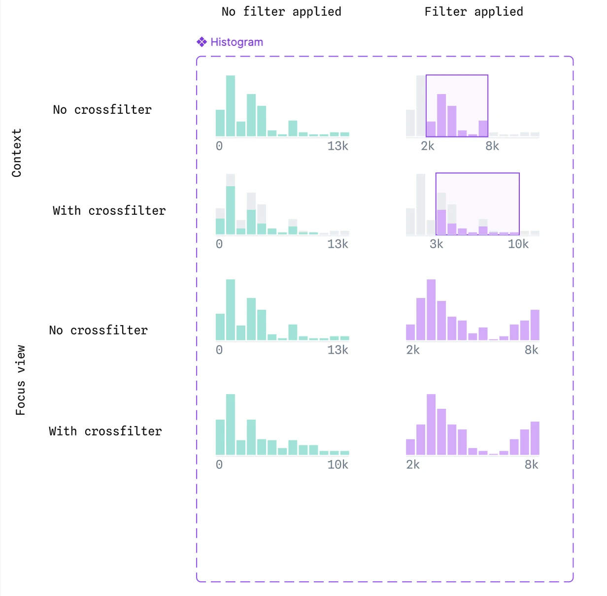
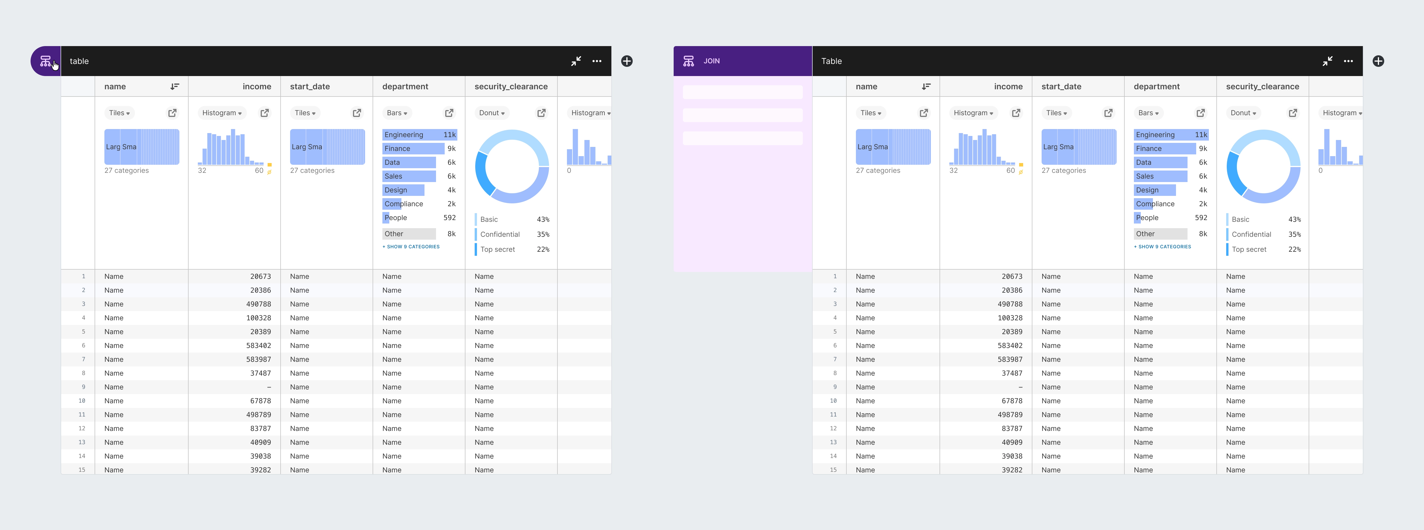
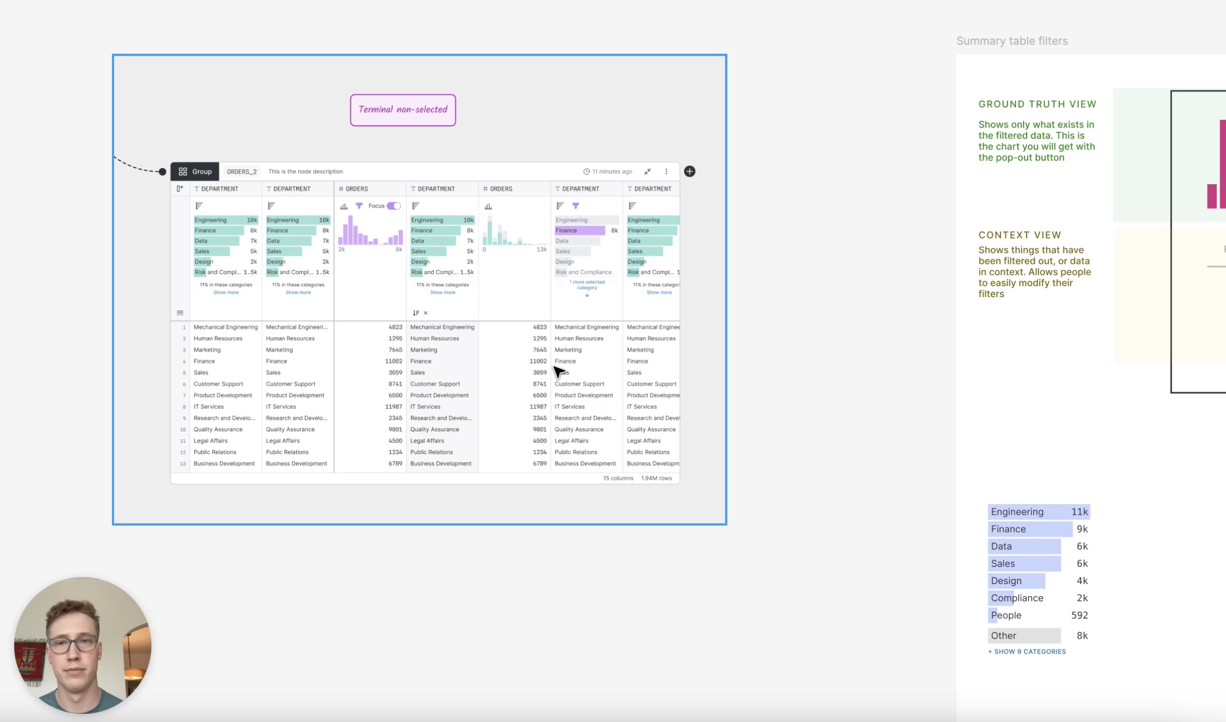
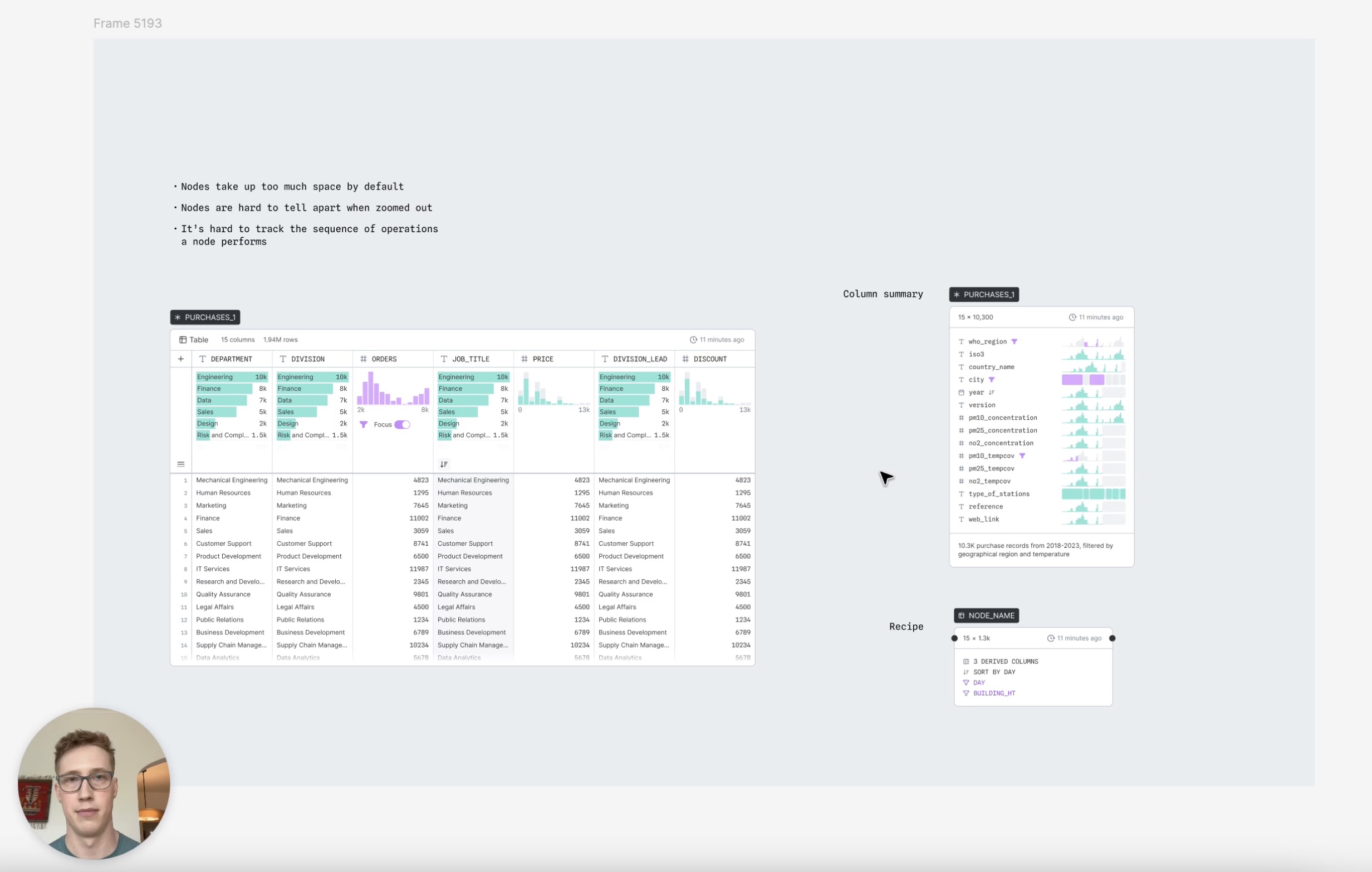
One of my biggest design responsibilities was owning the design of nodes, the core unit of work on a canvas. Our principle of “always be visualizing” led us to design each node as a table with summary charts at the top of each column where users could understand the distribution of their data at a glance and could directly manipulate it by interacting with these summary charts and table elements. Every node had the shared functionality of basic data manipulation: filtering, sorting, deriving new columns, etc. But we also had a handful of distinct node types that performed more specialized operations: joining data, grouping data, creating charts, and more.
The challenge in designing nodes was how to make the workings of this system immediately obvious to users, how to minimize the effort it took to create complex workflows using these nodes, and how to pack so much functionality into the nodes without creating an overwhelming interface.
1 / 11
Our initial sketch roughed out the key components like table layout, summary charts, and menu locations. We knew this version was crude, but it gave everyone something to react against and allowed us to open key questions about how users would interact with nodes.
One key decision was whether nodes would favor a horizontal or vertical layout. Competitive research revealed successful examples of both, and the company was split on this decision. We performed user research with these early prototypes and compiled multiple rationale docs, ultimately deciding on a horizontal layout primarily because we envisioned a future in which nodes may have a more square or tall aspect ratio, in which case a horizontal layout would allow more compact spacing.
From here, we needed a more refined “north star” for the company to picture how these nodes would actually appear in the application. So we continued refining the visual design and complementing it with surrounding UI.
Early on, we had to address how users would access the UI controls needed for special ops such as group or join. In our original sketch, these were accessed by clicking the node icon in the top left corner which would open a drawer, but this drawer was clunky, it looked awkward and covered up neighboring content. We were worried about reducing the size of content within the node by using a traditional sidebar, so we continued to experiment with a popover.
But ultimately, we realized this popover shared the same issues as the original drawer. A more traditional expanding sidebar was preferred, despite the potential to reduce the available area for viewing data. We experimented with both vertical and horizontal layouts, preferring the horizontal as it better matched our canvas layout.
As we continued to refine this idea, we realized we could take advantage of this sidebar to incorporate a second tab that would allow the user to access common column management tasks (such as renaming) without needing to scroll horizontally to hunt for their desired column.
For each of these design decisions we would go wide, exploring dozens of variants of this UI until we refined the concept to be as fluid and consistent as possible.
Our final design added text to the node type icons, to improve accessibility and discoverability, it reduced the area that used an inverted background for a more elegant design, and it packed the functionality of node settings and column management into a compact space that could be easily opened or dismissed by the user to allow easy access while maintaining maximum space for their data.
Simultaneously to our explorations of the node controls, we wondered how we could make it easier to create new nodes. In our original prototype, users had to click once on a “plus button” and then select the node type they wanted from a menu. For such a common action, two clicks was a drag—we conceived of a floating toolbar that would appear when a node was selected to allow creating new nodes in a single click.
Once again, we explored dozens of variations before nailing the UI. How could this toolbar be clearly associated with a node, make it clear to a user that this is how you add new nodes, and look elegant and well-integrated with the connectors between nodes?
Our final design achieved this with the following:
- The toolbar, the node tag, and the connectors and ports all shared a black color, to connect them as the key identifiers and pieces of UI that controlled the creation and flow of nodes.
- On a terminal node, a plus icon would be shown even when not selected, to invite users to continue the chain. Once selected, the icon would morph into the toolbar so it was clear that the toolbar was how you add new nodes.
- On intermediate nodes (those with connections on both sides) the toolbar would bump down so that it did not clash with the exiting port.
Deep dive
Never settling for “good enough”
Despite the quick pace of execution, I always kept a broad perspective of the product, identifying areas where we needed to think harder. We paid particular attention to the summary charts that live atop each column, as they were central to our “always be visualizing” principle. After several rounds of back and forth with our founder, we had two competing ideas, neither of which solved all of the user problems. I was pressured to pick one and move on, but I knew that such a core part of the product deserved better and I asked for two days to try to push us beyond our half-baked solutions.
After a several intense working sessions with my design partner, we broke down both solutions, showed the ways in which each one fell short, and then presented a third way that solved all of the use cases we had identified. In the end, our founder praised our instinct and drive to push harder, break down the problem in an analytical manner, and design a path forward that got us out of our local maxima and pushed us to a global maximum.
Impact
Blazing new territory
I thrive in the realm of product innovation. Throughout the development of Canvases I would proactively prototype new product and feature directions to influence strategy, challenge established thinking to drive the adoption of new interaction models, and reframe initial problem statements to uncover higher impact solutions.
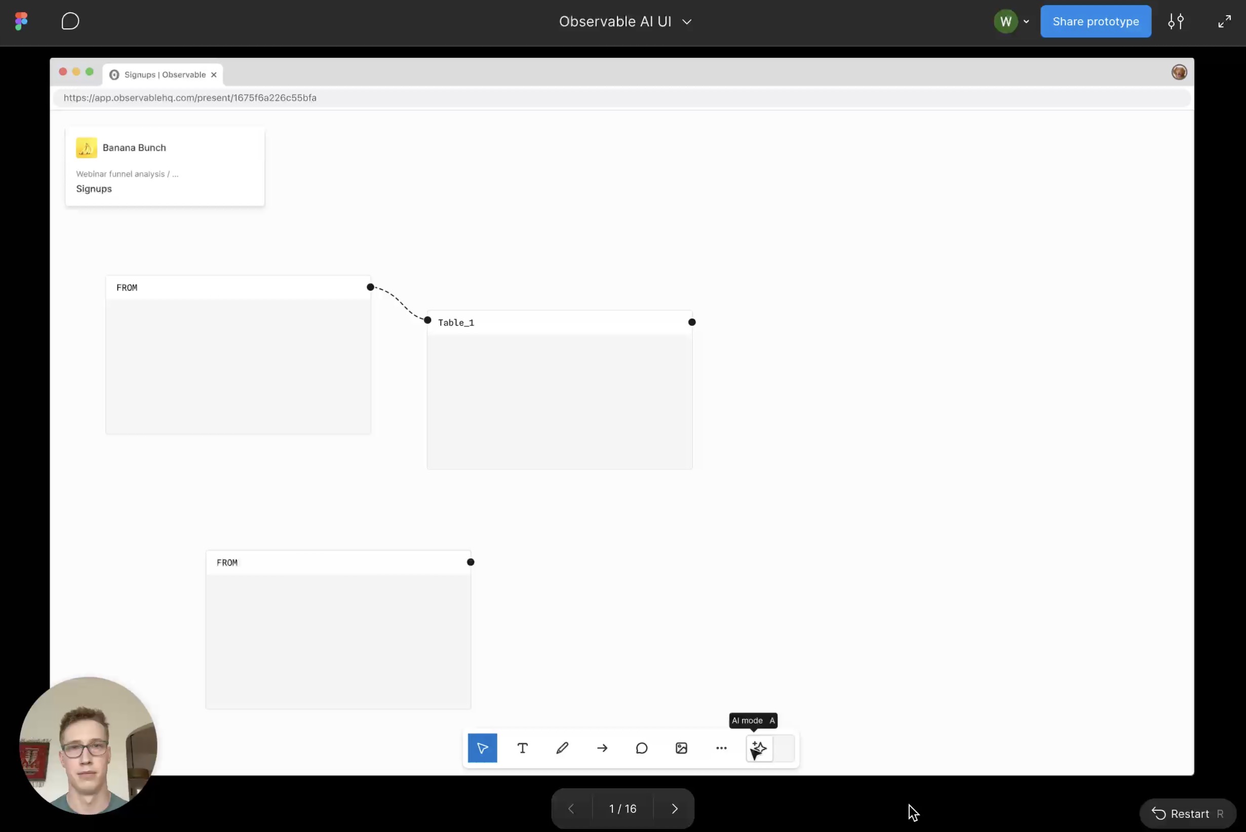
AI as a canvas collaborator
One example came in the development of our AI assistant on the canvas. We wanted our AI to feel integrated and native to the canvas environment, but our early prototypes followed the typical side panel chatbot paradigm. I prototyped a novel interaction model where the AI acts as a collaborator that you communicate with through cursor chat. The prototype helped push our team to think wider, my manager responded by saying “This is exactly the kind of thinking we need right now.” And ultimately we landed on a new concept of spatial AI—where work from the AI happens directly on the canvas with annotations that feel as if you were collaborating with a helpful colleague.
Shifting strategy to put experience first
Another example came in our shift to a PLG strategy. After nearly a year of breakneck development, the product had an impressive feature set, but it had accreted clunkiness due to speed of execution and a sales-led growth model that forced us to leave many features on their v1 implementation. I looked at the state of our product and our customer feedback and realized we were heading down a scary path—a product that sounds good on paper but doesn’t deliver on the promise when you start using it. So I began documenting these issues, carefully laying out the key problems getting in the way of a great user experience, potential solutions, and how we should prioritize them.
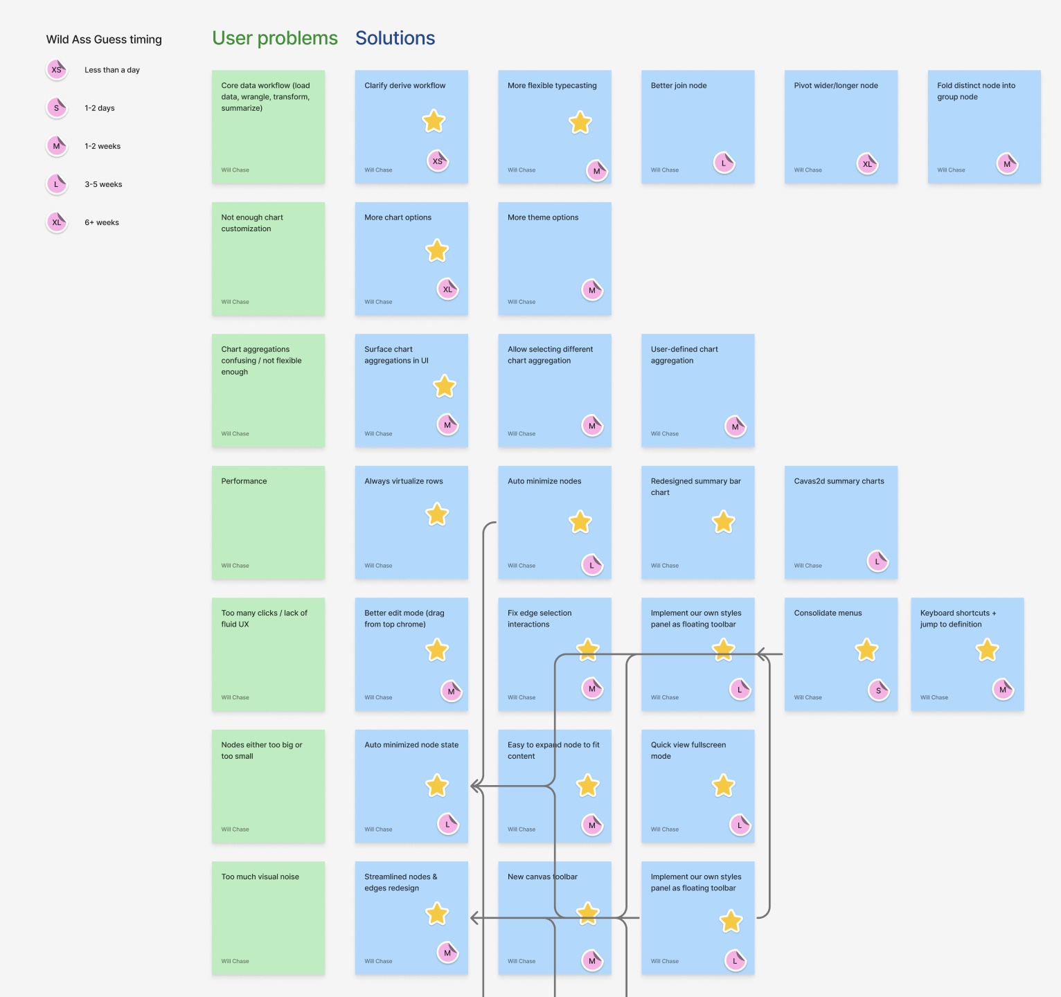
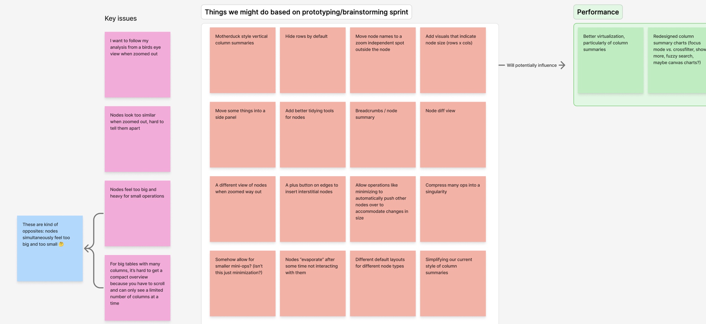
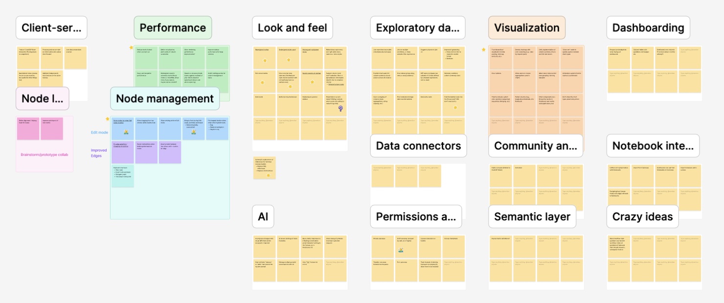
After a lot of documentation, advocacy, and alignment, leadership decided we did need to shift to a PLG model and focus on solving these core issues. The result was a large shift in product strategy and roadmap, culminating in a three week “better canvases” sprint in which we prototyped and proposed solutions that would solve these core issues and make the product experience great from level one.
Outcomes
Where things stand
Observable Canvases was successfully launched to a small group of customers, where it saw early adoption and strong qualitative feedback. Users particularly valued the core concept of the infinite canvas, which allowed them to quickly duplicate workflows, tweak things, and lay out their pipelines to match reality. Our chart builder and data visualizations recieved strong feedback with users saying that our tool consistently outclassed competing products in this area. And initial usage patterns suggested a deeper potential for the product to combine the concept of data analysis and whiteboarding—customers loved using the tool to lay out data analyses as diagrams that incorporated sticky notes, arrows, shapes and more to simultaneously analyze data and explain the pipeline and methodology in space.
Due to a company-wide pivot toward AI products, further development was paused before the product could reach broader market validation.
While the product did not reach full maturity, Canvases validated its core concept and demonstrated the viability of the design. From a personal perspective, I'm immensely proud of the work we produced on Canvases—I think it's an innovative piece of software that matched the mental model of branching messy data analysis with the medium, allowing users to explore data in a more natural and fluid environment. This product challenged me every day and helped me to grow by leaps and bounds as a designer.