Making the Data Visualization Society Timeline
April 2, 2019
Concept
From my first glance at the DVS challenge data, I knew I would make a timeline. There was detailed time data (to the hour), and I knew from the DVS Twitter that there was a huge flood of applicants at the beginning and they even had to stagger invites, which I thought might make for an interesting timeline. Also available were the applicants’ rough latitude and longitude, and their self-assessed score in 3 categories: visualization, data, and society.
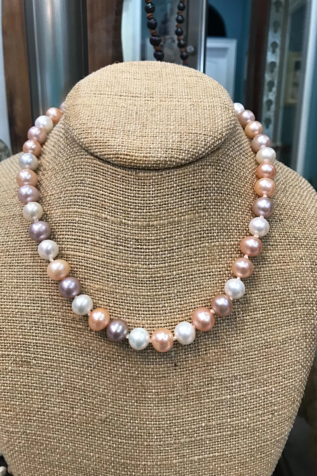
I can’t say how it came to me, but early on I got the inspiration to visualize the timeline as a string of pearls. I remember my Mom buying a beautiful freshwater pearl bracelet at the flea market when I was a kid, and I imagined my viz would show each member as a pearl, colored by their region and sized according to some skill level, with the timeline being the string connecting all the pearls.
Early sketches
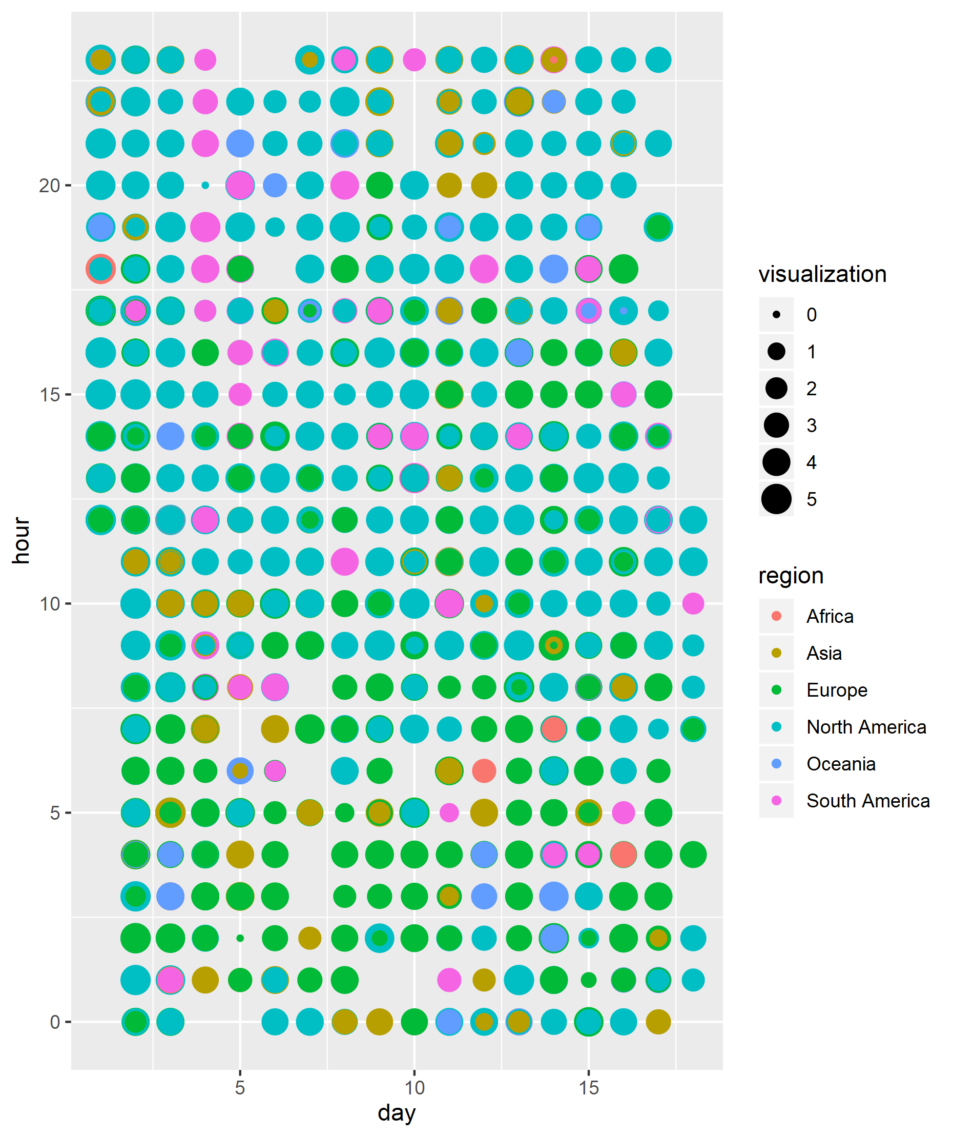
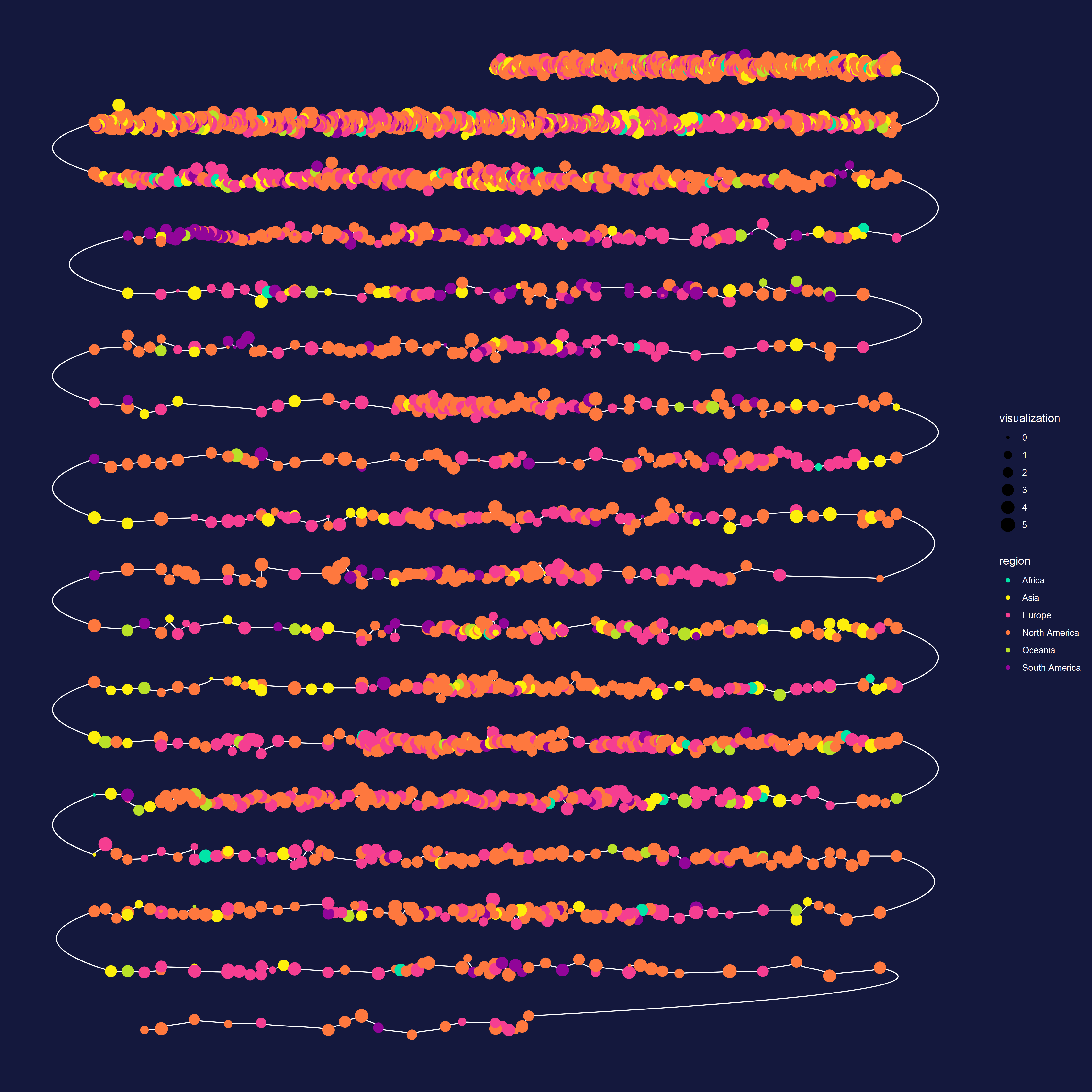
Hand sketching has never been my strong suit, so for a few days I doodled various layouts and encodings for this data. When I started, I did not know if I would make the timeline linear, circular, break up individual days, or even how I would encode the different skills. After just a couple sketches, I jumped right into coding and tried to get something on the screen. My first task was to figure out which continent each person was from. Geocoding in R is super annoying now that google maps changed their API rules, so I used a rather long and janky way to geocode these without an API, but it worked well. I first plotted all of the points sized by visualization skill and colored by location. Each day is on the X-axis, and the Y-axis is the hour of the day. Of course, many hours had lots of people sign up, so the points are all stacked on top of each other.
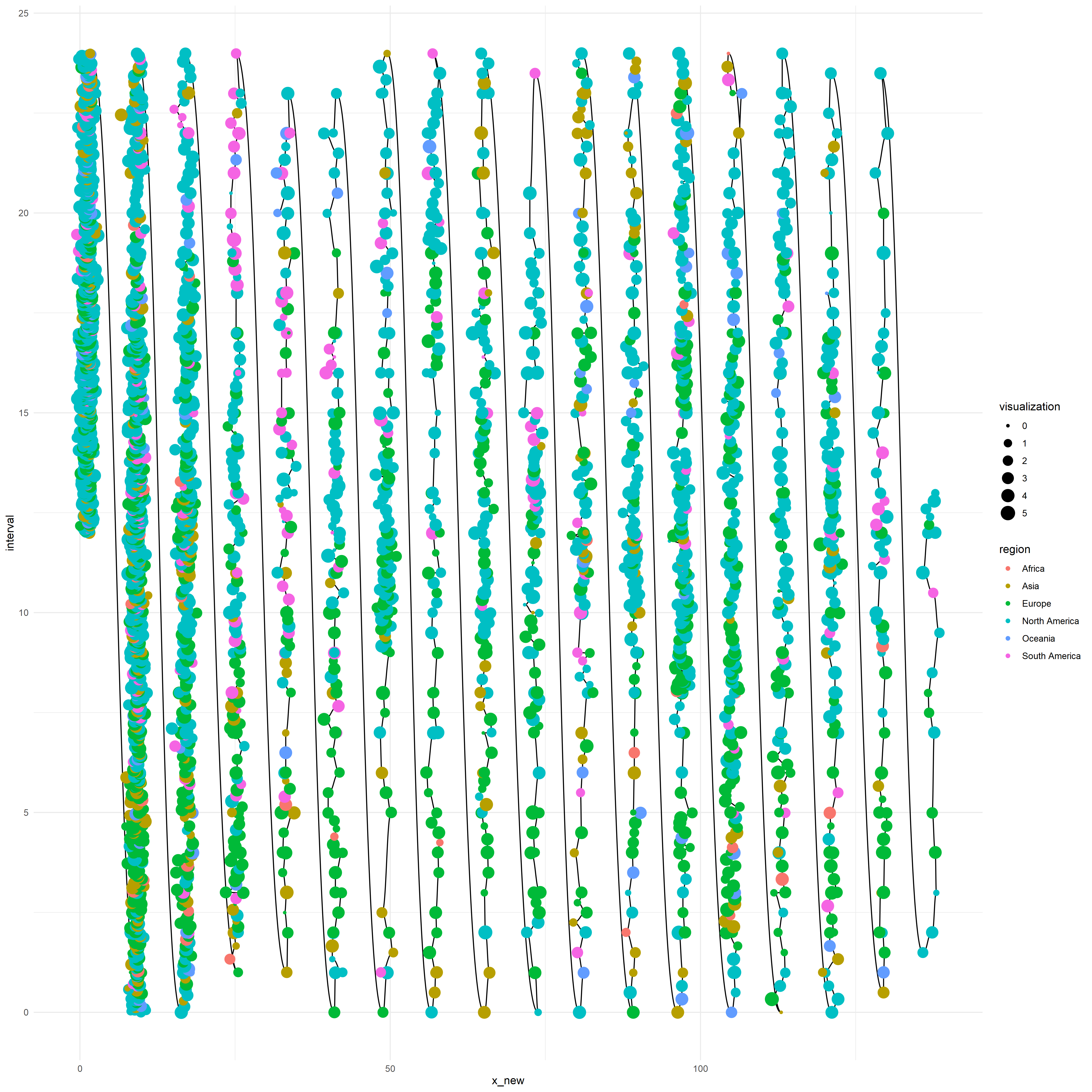
I continued designing-by-code, and recoded the points to be evenly spaced within each hour. I also decided to encode the data and society scores by using them to jitter the points along the X-axis. To do this I calculated the difference between the data and society scores and set their X positions to correspond. I also did some custom spacing on the X-axis to create more padding between the days. Finally, adding a line to connect all of the points yielded my next sketch.
The switchback
I loved the connectedness of the timeline in the last sketch, and knew that I wanted to change the connections to be like a switchback path, and flip the whole thing so it would read vertically. To achieve the switchback, I reversed the order of the points for every other day and added connections between the days. I tried many different types of connections, all of which I implemented with geom_bezier from ggforce. Calculating all of the control points for the bezier curves involved getting the endpoints for each day, and doing a little dplyr wrangling to make sure everything was even and in the right order. At this point, I had the bones of my final graphic, and exported a version to test out some aesthetics. Here’s a version I made to test all the spacing and vertical alignment:
Filters, design, decisions
Since I was suspicious of the links between the points, I wasn’t sure that my original pearls idea would work out, but I tried one anyways to see how it looked. To achieve a pearl look I created a different radial svg gradient for each color and applied it to my exported ggplot svg manually (search+replace makes this relatively easy).
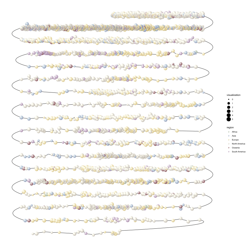
I actually really liked the pearls effect, and I’m definitely stocking that away for later, but it was clear that this just wasn’t working visually for this project.I had been messing around with watercolor effects recently, so I decided to switch gears and try applying a watercolor svg filter (also manually applied to the base plot). I thought this was gorgeous (except for the lines underneath), and decided to run with it.

Sleeping on it
I got busy around this time, and took almost a week without touching the project. This gave my ideas time to develop and I decided it was best to remove the connections between points and just have a straight line for each day. This gave a lot more readability and clarity to the plot and also made it easier to see which points were above or below the zero line (indicating a balance towards data or society skills). I also settled on cubic bezier links for the endpoints, and did a lot of refining of color choices.
When I had my base graphic all ironed out, and exported a large version to test, it looked awful. The problem was that my svg filter looked good on small points, but looked ugly with the large sized points in the full-sized poster. After a lot of frantic tweaking of the filter, I got something I was 90% pleased with, and decided it was as good as it would get for now. I added a paper effect svg filter for the background and brought the poster into Inkscape for final edits. Lots of time was spent adding annotations, tweaking legends, colors, text, fonts, spacing, and all the other minutia that take 20 times longer than you expect.
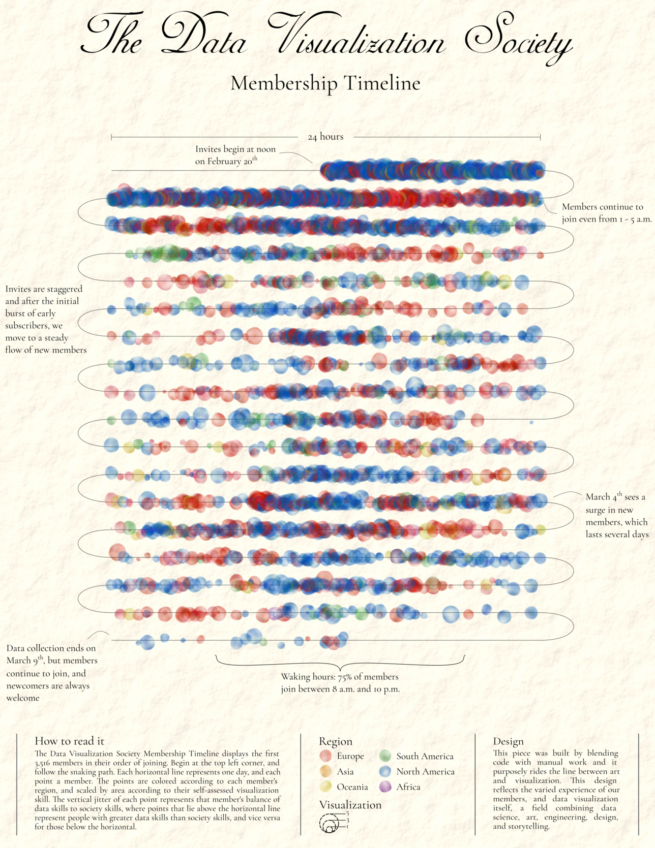
The final result was a somewhat vintage looking poster that I was very pleased with. I could have gone full-on vintage by using more muted colors and some distressed filters, but I wasn’t keen on the hyper-realistic antique look. Overall, I’m really happy with the snaking timeline structure, I like the typography, and I’m satisfied with the watercolor effect. I was aiming for something that rode the line between data art and data viz, and I think I achieved that balance. I would be happy to print this and hang it on my wall. This first DVS challenge was super fun and definitely pushed me to come up with what I think is a pretty novel design and follow through on a tricky implementation. I also got some very useful feedback from the DVS critique channel, including a comment from Carl Manaster that the switchback style of reading the plot was similar to Boustrophedon, a type of bi-directional text that was common in many ancient languages—how neat! All the code for the project is on my GitHub. Hope you liked the end result and learned something from the process—I certainly did and I look forward to more DVS challenges!