Visualizing Risk: Remotely Triggered Earthquakes
July 14, 2019
Take me to the project!How it all started
I started using Mapbox earlier this year and I was hooked from the start. I’ve dabbled in geospatial analysis and visualization before, but I was always put off by the huge barrier of entry. Most spatial analysis requires massive amounts of domain expertise, knowledge of specialized data sources, and a huge time investment to gather the data, clean it, and harmonize it to all work well together. Things like projections, missing data, and bizarre file formats make this whole process a major headache for non-experts. Mapbox makes all of those pains disappear. So, when Mapbox and the Data Visualization Society announced the Visualizing Risk challenge, I was immediately interested.
I let the idea brew for a while, with some vague wisps of ideas forming in my subconscious. Then one day the question came to me out of nowhere: can one natural disaster influence the risk of another? I knew of aftershocks from earthquakes, or flooding from hurricanes, but I was curious if there were connections that spanned larger distances and time periods. After a night of research, I realized the answer was “yes”. I now had a question that excited me, but I had so many commitments that I was worried I would not have time to do it justice, and as a novice with Javascript and web-dev I wondered if I would have the coding skills required to bring my vision onto the web.
Part 1: Research and data analysis
Despite my trepidations, I found the question so interesting that I decided to move forward with research and plan an outline for the story, still unsure if I would follow through with the full project. My initial research led me to the phenomenon of remotely triggered earthquakes. Though I appreciated the datasets that were provided for the challenge, my question about disasters influencing the risk of other disasters led me down a different road, and I started a deep dive into seismology literature. I’m used to reading scientific papers, but seismology was a completely new discipline for me, and it was a steep learning curve that involved many late nights of reading and googling. The literature around remote earthquake triggering is very back-and-forth, with researchers disagreeing on many aspects of the phenomenon, which makes it tricky to navigate. I had to carefully assess each paper, consider how the data and arguments had aged, and compare how other papers evaluated it. During this time, I exchanged many emails with Mr. Robert O’Malley, a researcher at the Oregon State University who was the lead author on the paper that initially sparked my interest in remote earthquake triggering.
After several days of reading and synthesizing, I formed an outline and went looking for my data. I was very lucky that Mr. O’Malley was kind enough to provide his raw data. And I supplemented that with earthquake data from the USGS Earthquake Catalog, and data pulled from some selected papers. The data provided by Mr. O’Malley needed very little work, and I just made a few small tweaks in Excel (“Excel!? Yuck!” I know, I know, you can tar and feather me later). Most of my analysis revolved around a set of earthquakes that demonstrated remote triggering: The Landers California earthquake of 1992, and the Indian Ocean (Sumatra) earthquake in 2012. Remote triggering refers to earthquakes that occur after a large earthquake, and are outside of the aftershock zone. So for my data analysis, I collected all earthquakes within the ten days before and after the main earthquake (mainshock). The data comes from the USGS Earthquake Catalog, which has a very nice and easy to use interface. These were all downloaded as one CSV file, which I imported to R for analysis. For each of the earthquakes of interest, I want to compare the earthquakes in the ten days preceding it, to the ten days following it, while ignoring anything within the aftershock zone. The aftershock zone is loosely defined, but I’ve read from within 1-3 times the rupture length of the mainshock. I grabbed these numbers from google, then calculated the Haversine distance from each earthquake to the mainshock. I classified anything less than two times the rupture length to the mainshock as an aftershock, then split the remaining into earthquakes before the mainshock and after the mainshock (triggered). I added some useful fields like an ID, and exported these tables as geojson files. Here’s an example of how I analyzed one earthquake, and the full code with input data can be found on my github.
#load libraries
library(tidyverse)
library(geosphere)
library(geojsonio)

#load data, extract the mainshock into a separate dataframe and define the time and rupture length
landers <- read_csv("landers.csv")
landers_mainshock <- landers %>% filter(mag == 7.3)
landers_rupture_length <- 80 * 2 * 1000
landers_mainshock_time <- landers_mainshock$time

#calculate the haversine distance from each point to the mainshock
landers_dist <-
  landers %>%
  mutate(mainshock_lon = landers_mainshock$longitude, mainshock_lat = landers_mainshock$latitude) %>%
  group_by(id) %>%
  mutate(dist = distHaversine(p1 = c(mainshock_lon, mainshock_lat), p2 = c(longitude, latitude))) %>%
  ungroup()

#filter aftershocks and by time to get triggered earthquakes
landers_triggered <-
  landers_dist %>%
  filter(time > landers_mainshock_time) %>%
  filter(dist > landers_rupture_length) %>%
  arrange(time) %>%
  mutate(id_overall = row_number()) %>%
  mutate(day = lubridate::floor_date(time, unit = “day”)) %>%
  group_by(day) %>%
  mutate(id_day = row_number()) %>%
  ungroup()

#filter aftershocks and by time to get earthquakes before the mainshock
landers_before <-
  landers_dist %>%
  filter(time < landers_mainshock_time) %>%
  filter(dist > landers_rupture_length) %>%
  arrange(time) %>%
  mutate(id_overall = row_number()) %>%
  mutate(day = lubridate::floor_date(time, unit = “day”)) %>%
  group_by(day) %>%
  mutate(id_day = row_number()) %>%
  ungroup()

#filter to collect aftershocks
landers_aftershocks <-
  landers_dist %>%
  filter(time > landers_mainshock_time) %>%
  filter(dist < landers_rupture_length) %>%
  arrange(time) %>%
  mutate(id_overall = row_number()) %>%
  mutate(day = lubridate::floor_date(time, unit = “day”)) %>%
  group_by(day) %>%
  mutate(id_day = row_number()) %>%
  ungroup()

#write before and after dataframes to geojson
#can also write mainshock and aftershocks using the same code if needed
landers_before %>%
  select(time, latitude, longitude, mag, id_overall, id_day, day) %>%
  geojson_write(., lat = “latitude”, lon = “longitude”, file = “landers_before.geojson”)
landers_triggered %>%
  select(time, latitude, longitude, mag, id_overall, id_day, day) %>%
  geojson_write(., lat = “latitude”, lon = “longitude”, file = “landers_triggered.geojson”)
Part 2: Making a canvas
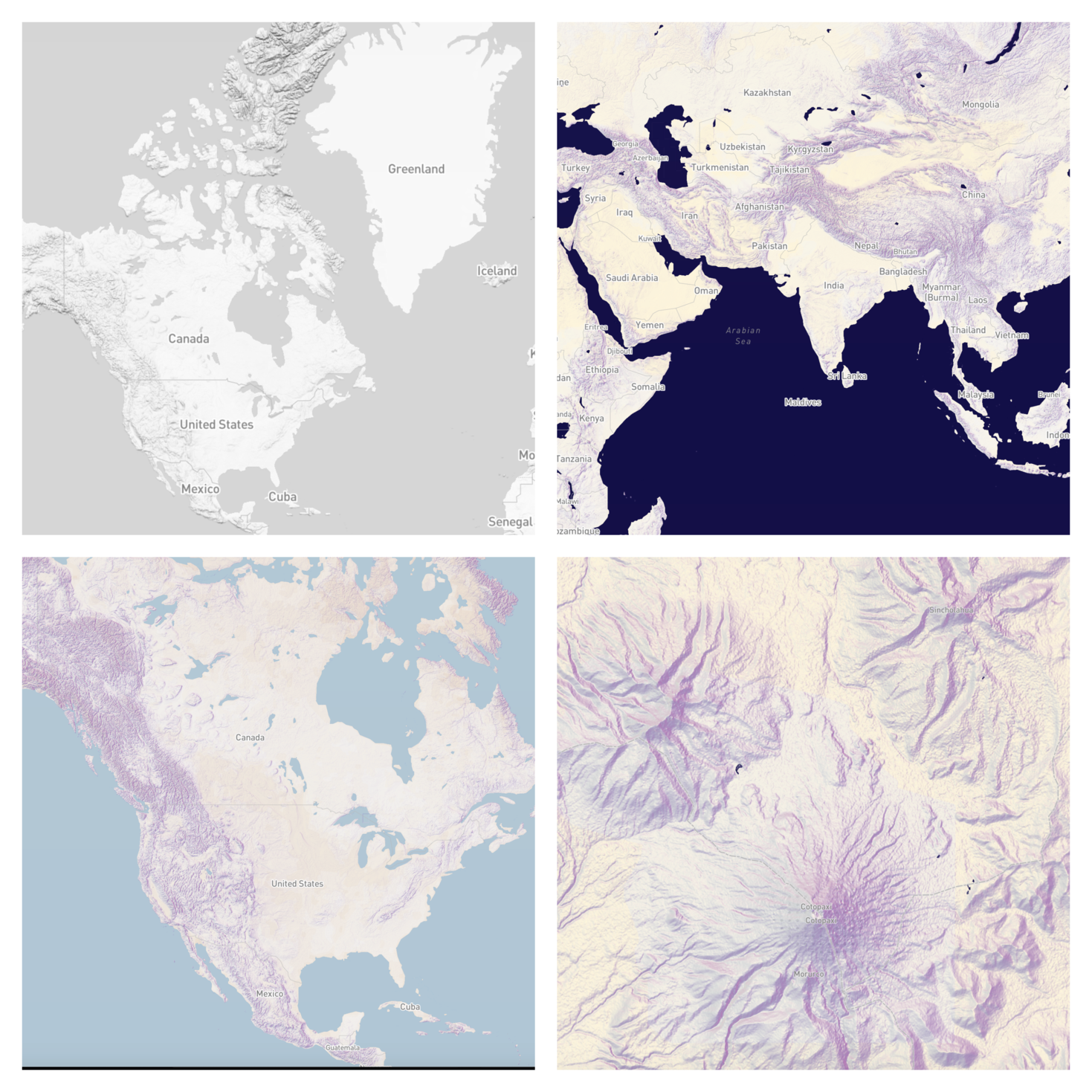
What a world we live in that I can just log in to Mapbox Studio, start a new style, and in about five minutes, have a darn good looking map ready to use in my project. In reality I spent a little longer than five minutes, but the fact remains that Mapbox has done such a great job with this product by designing a powerful yet intuitive UI, combined with default styles that are expertly designed by experienced cartographers, that it’s really tough to screw this part up.
I started with a greyscale map because I wanted to put the focus on the data. I believe I made this style before Mapbox released their monochrome tool, so I did the greyscale coloring by hand, but it was a breeze nonetheless. I gave the map an exaggerated hillshade (again, dead easy using Mapbox’s built-in terrain-RGB data), to give it some depth, and it seemed appropriate given the topic on seismology. I also tested out some multidirectional colored hillshading, but ultimately decided that while beautiful, it was a little distracting. I love the colored maps if this were for pure cartography, but the greyscale canvas really puts the focus on the data, which I think helps to guide reader’s eyes towards the point I want them to see.
Part 3: All the code
At this point I had my data prepared, an outline of my story, and a basemap in hand. I knew I would be preparing a scrollytelling piece, something that I had almost no experience coding. I’m new to Javascript and web development, so I was hoping to keep things simple…that didn’t really work out. As the complexity grew, it became clear that I needed to use D3 for all of the shape rendering, and that the previous scrollytelling library (enter-view.js) that I had experience with just wouldn’t cut it.
I spent many hours figuring out how to integrate Mapbox and D3 before finding the magic key. This repo by Jordi Tost is a gold mine, and it contained everything I needed to render my points from geojson using D3. After a couple of initial tests, point rendering was going smoothly, so I moved on to the scrolling interactions. Here’s the key to getting Mapbox and D3 to play nicely together:
//////////////////////////
// Mapbox+D3 Connection
//////////////////////////
// Get Mapbox map canvas container
// Setup svg dims and margins
let canvas = map.getCanvasContainer();
let svg = d3.select(canvas).append(“svg”).attr(“id”, “my_svg”);
let svgSelect = document.getElementById(“my_svg”);
let rect = svgSelect.getBoundingClientRect();
const width = rect.width;
const height = rect.height;
const margin = ({
  top: 50,
  right: 30,
  bottom: 70,
  left: 30
});

// Define an update function to reproject the points when the map moves
// Update d3 shapes’ positions to the map’s current state
function update() {
  console.log(“update”);
  svg.selectAll(“circle”).attr(“cx”, function(d) {
      return project(d.geometry.coordinates).x
    })
    .attr(“cy”, function(d) {
      return project(d.geometry.coordinates).y
    });
}

// In your D3 draw function, call the update() function after rendering points
// also call on map movement

function draw() {
  // Your D3 code goes here
  // Select, enter, append your points

  // Call the update() function
  update();
  // Update on map interaction
  map.on(“viewreset”, update);
  map.on(“move”, update);
  map.on(“moveend”, update);
}
I went with Scrollama and after a little bit of head-scratching, things finally clicked. I really appreciate the Scrollama API, and though the handleStepEnter() and handleStepExit() functions get a little out of control, it really packs all the power and flexibility needed for this type of project. From here it was just a coding marathon over about two weeks to see if my novice D3 and Javascript skills were up to the task. I ended up integrating several libraries for rendering my visualizations, including D3, the Mapbox GLJS API, and deck.gl.
The piece overall tells the story of remotely triggered earthquakes. When a large earthquake strikes, it sends out seismic waves that wrap around the earth and meet on the other side. Recent research has shown that these seismic waves often trigger other earthquakes at great distances from the source event. Earthquakes are difficult to predict, one of the reasons being that we do not understand all of the factors that cause them. Incorporating information like this may help us to better predict when and where earthquakes will strike (though that goal is still a long ways off if we’re being realistic). I designed the piece to be a narrative rather than an exploratory one, and that led me to remove direct interaction with the data in favor of a storytelling experience guided by scrolling. In the end I was surprised by what I was able to accomplish and I’m quite proud of it, I hope you enjoy it too!
Here’s a teaser, and you can see the full project HERE. Also, see all of the code on my github.
Reflections
This piece went through several revisions as I was coding it, whether because I realized something would not be feasible in the time I had left, or because I realized the story demanded a different approach. So, having seen the final product, what would I do differently? Mainly, I regret all of the things I just didn’t have time for. I was working on this project solo and only in my very limited free time, so there were many pieces that I had to cut to make the deadline. Most importantly I didn’t get to really explore some aspects of risk prediction as much as I would have liked. I wanted to include an explorable interactive at the end that showed several large earthquakes with their triggered earthquakes and the proximity of each to populated areas or cities. The risk from earthquakes is hugely dependent on where they strike, and without this piece I think my overall narrative falls a little short on the goal of communicating hazard risk in terms of loss of life or damage to structures. Another drawback is I didn’t have time to optimize it for mobile (or even for small screens). Maps are always hard on mobile, but I’m no CSS wizard, and with the deadline, this unfortunately only looks good on a large screen (15in or 1400px).
On a personal level, this project was an emotional roller coaster. I took on this project out of passion for the idea and data visualization, but at the time I was extraordinarily busy, and this was a commitment that I really didn’t have time for. During the month leading up to the deadline I was working about 14 hours per day seven days per week, with hardly any breaks. That kind of stress is crushing, and it made the result of this all the more important; if this failed then what was all of that work for? This was also a big gamble since when I started the project I had almost no experience to think I could actually realize it. I wrote my first line of Javascript three months ago, and until now my experience was limited to a few simple D3 charts on Observable. The stress buildup from overwork combined with the trials and tribulations of learning a new coding language on a deadline had me at times crying into my cereal, and at others jumping for joy. Given all of this, I’m incredibly proud of what I’ve produced. The project turned out better than I ever could have imagined. It’s not perfect—but nothing ever is—and I’m willing to admit that I really impressed myself with my coding ability on this one.
Though I say I was solo, I was not alone. I have to thank the many people that made this possible, and without whose help I never could have made it. First up is Mapbox, the Data Visualization Society, and the Understanding Risk partners for sponsoring this competition and making it possible in the first place. Lo Benichou was very kind and helpful when I was stuck in the depths of some bugs that I just could not see, and I thank her for being so involved and available to me with my dumb questions. Time for a short story: One night I was working on a chart prototype in Observable and was having some trouble. Around midnight I left my half-finished code and turned on the TV while preparing for bed. Twenty minutes later I see an email pop up on my phone that Mike Bostock has added fixes and comments on my chart and submitted a pull request that would have it working. I guess people who have been working on D3 for longer know how generous Mike is with his time, but I was floored. I never tweeted out that I was working on this, so I can only guess that Mike goes around browsing the latest Observable notebooks and doling out bug fixes like some magical elf. It’s certainly not something that he has to do, and I am very grateful for the help. Finally, I never could have managed this without the immense support of my partner. He cooked, he cleaned, and he was just there to support me through the entire thing—entirely selfless, he never complained, he was the perfect sounding board for my ideas, and he supported me unconditionally.