
Animated waffle charts with D3 and GSAP
October 13, 2019
Why are we animating?
Most charts don’t need to be animated, but it sure makes them more fun. I lump dataviz animation into two main categories: data-driven and fun. Data-driven animation is justified or even required based on some property of the data, and is used to convey movement, maintain data permanence, or display data updates through time. Fun animations are not necessarily linked to any data-driven property, and are often maligned as gratuitous. While I agree that a lot of these animations are unnecessary, they do serve a purpose. Fun animations can engage, ease viewers into a chart, and delight. Fun animations are also better suited to public-facing projects, where you will be trying to pull a large audience of non-dataviz-experts into your visualization. There are some people who would tell you to eschew fun animations entirely, and while I respect that opinion, my personal feeling is that data visualizations should be fun and engaging to reach the widest audience, and I prefer to risk a little gratuitous animation if it can bring more engagement and joy to my visuals.
The reason for all this discussion is that today I will walk through how I used GSAP along with D3.js and flexbox to create this fun animated waffle-bar chart.
This is my first D3 tutorial, and I think it’s appropriate because it hits on a key theme that D3 is not a data visualization library. Rather, D3 is a collection of modules that help you make visualizations—it includes utilities for DOM manipulation, scales, layouts, shapes, transitions, and more, but none of these will allow you to create charts on their own. In this tutorial we will use D3 to create a series of DOM elements (no SVG!) that represent our data, then we will use flexbox to organize and lay out those elements, and GSAP to animate them. A key idea here is using the best tool for the job. If you wanted, you could use D3 to lay out all of the elements, but it would require lots of custom code, whereas flexbox enables the same layout (and responsive!) with just a few lines of CSS. Likewise, you could spend a long time rolling some custom D3 transition code, but GSAP allows us to accomplish the same thing with a simple function. Now, enough rambling, on to the actual tutorial!
You can see this whole project and follow along with the code on CodePen
A plan of attack
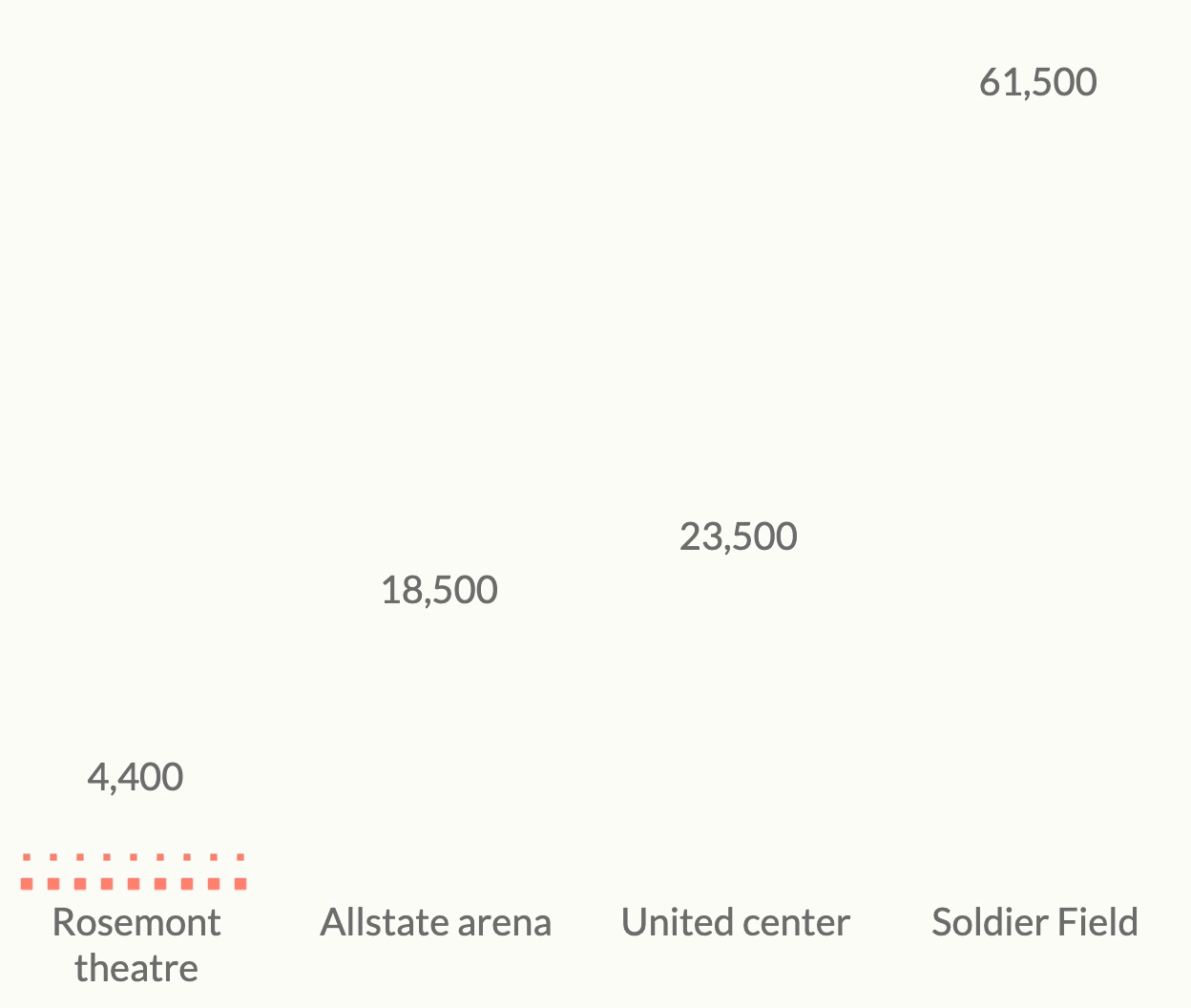
Understanding how to format your data is often half the battle when building a chart. And understanding how that chart will be built is key to figuring out how to format your data. So, let’s build a blueprint of what we want to build and do a mental walkthrough of how we will get there. Here’s our starting point: we want to visualize the number of concertgoers for four concerts. We will visualize each concert as a waffle-bar, meaning that each concert will be represented by a bar, but rather than a solid fill, it will be populated by little boxes, each one of which represents 250 people. Our data consists of an array with the four concerts, how many people attended, and the number of boxes for each bar (assuming 1 box = 250 people).
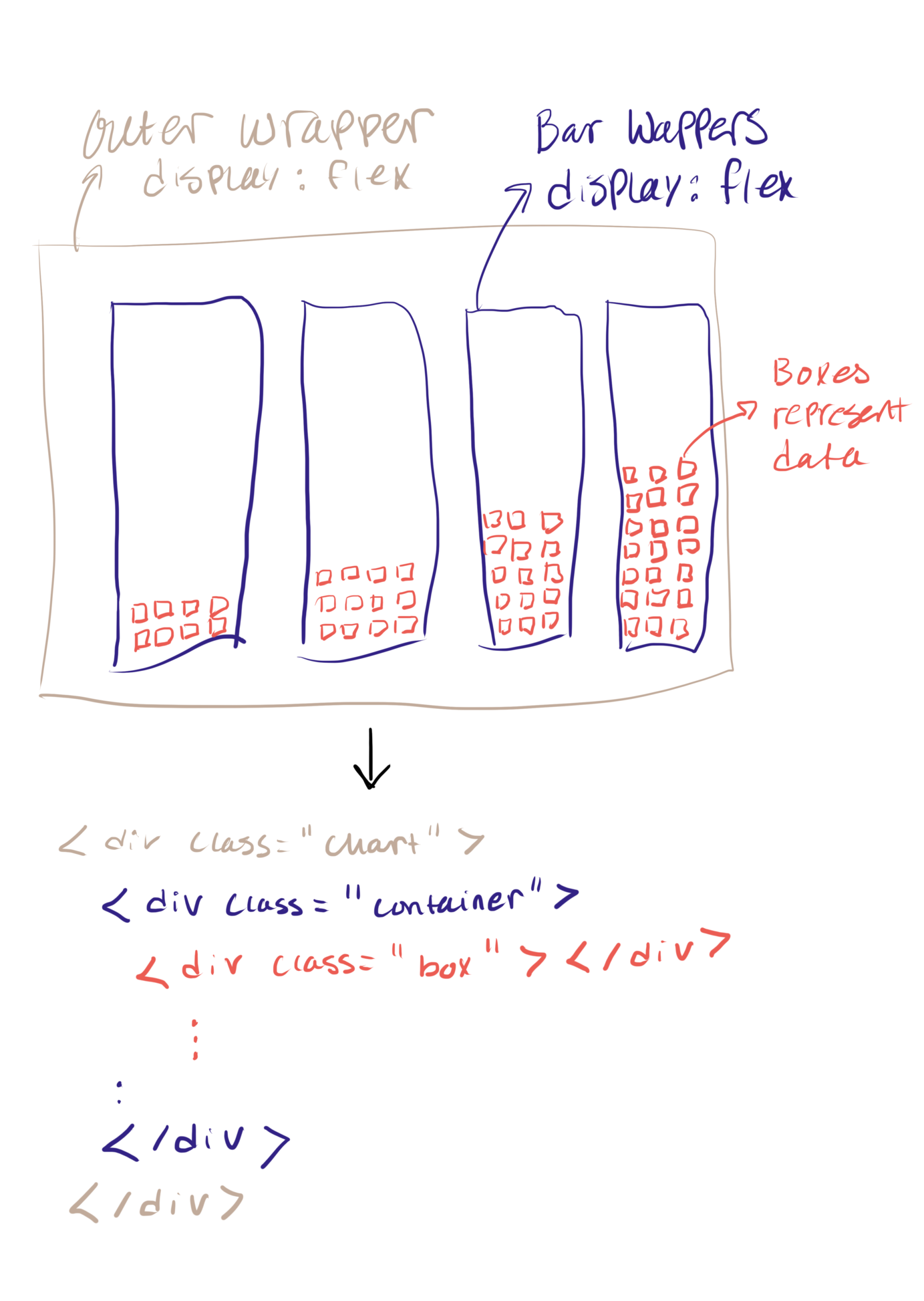
To achieve this layout, here’s my plan: create a nested array with 4 objects at the top level, one for each of our concerts. Within each concert object will live an array of objects representing our boxes. Then we will create a div for each of our 4 bar wrappers by looping through the top level of our nested data using D3’s .data() method. Then to create a div for each box, we will again loop through our data, this time using an accessor to access the array of boxes within each of our concert objects.
Data preparation
Getting our data into the nested format described above requires two steps. First, we will create an array of objects representing each box we want to render. We can do this using an “uncount” style function, which will create as many objects as we specify based on the boxes variable in our dataset. For example, uncounting our first concert will yield 18 objects, since we have boxes: 18. After uncounting, we will take our big list of boxes and nest them by concert using D3’s .nest() method.
//uncount function
uncount = (data, accessor) =>
  data.reduce((arr, item) => {
    const count = accessor(item)
    for (let i = 0; i < count; i++) {
      arr.push({
        ...item
      })
    }
    return arr
  }, []);

//uncount our original dataset based on 'boxes' variable
const boxes = uncount(data, d => d.boxes);

//create nested dataset based on concert (venue)
const nest = d3.nest()
  .key(d => d.venue)
  .entries(boxes);
Creating our elements with D3
With our data prepared, it’s finally time to render our elements with D3. If you’re new to D3, you’re probably familiar with using SVG to render your elements, but there’s no reason that has to be the case. Here, we’re just going to use HTML and make a <div> for each of our elements. We’ll start by making a wrapper for our chart by just adding some HTML to our page <div class="chart"></div>, then we’ll select our chart and add the containers for each of our waffle-bars:
//select our chart wrapper
const graph = d3.select(“.chart”);

//loop over our nested data and render a container
//for each concert venue
const group = graph
  .selectAll(“.container”)
  .data(nest)
  .join(“div”)
  .attr(“class”, “container”);
So, what’s happening here? Let’s do a line-by-line breakdown.
- First we’re taking our
graphvariable, which is a selection of our chart wrapper, and using.selectAll(“.container”). This returns a selection, which contains all children of the.chartelement which have the.containerclass. Right now, those don’t exist, so the selection is empty, but soon we will create them. - Next is
.data(nest). This tells D3 to loop through each element of thenestarray and do something. We’ve got 4 entries, each representing one concert in ournestarray, so for each one we will… - To actually create the element, we use the new
.join()method from D3v5, telling it to create adivfor each element in our array. This is equivalent to the.enter().append()pattern from D3v4. - Finally, we set the
classof each div to.container.
Next we’ll use the same pattern to append the boxes to each of our bar containers. All we need to do here is select our group object and access the inner array of boxes with our .data() call by using an accessor function d => d.values. We will also set the color of each box using a simple categorical color scale.
//color scale
const colors = [“#FF8E79”, “#FF6B5B”, “#FF4941”, “#DB1D25”];
scaleColor = d3.scaleOrdinal()
  .domain(data.map(d => d.year))
  .range(colors);

group
  .selectAll(“.box”)
  .data(d => d.values)
  .join(“div”)
  .attr(“class”, “box”)
  .style(“background-color”, d => scaleColor(d.year));
Flexbox layout
There are two main pieces that we need to lay out in our graph, and each of them will use flexbox. Flexbox is a CSS property that helps to create responsive layouts (often grids). If you’ve never used flexbox, I recommend this tutorial. To lay out our bar containers, we simply give our chart wrapper the display: flex; property. To create a grid for our boxes inside each bar container, we want to give the bars display: flex;, but there’s a few other important bits. By default, flexbox will try to put everything on one line, we want our boxes to wrap to a new line when there’s no more space in the container, we’ll use flex-wrap: wrap-reverse;. Wrap reverse because we want our boxes to wrap from the bottom upwards, not top down. Then we want to make sure all of our boxes are justified to start from the bottom and left-hand side of our containers using justify-content: flex-start; and align-items: flex-start;. Et, voila! There’s a few more bits to the CSS to make everything properly sized, and give some margin between our boxes, etc. Check out the full CSS on the CodePen.
Animation with GSAP
Now, the real reason you’re here, that cute little grid grow animation. Like many other things, I only figured this one out thanks to Twitter. I dreamed up this animation and then remembered something Sarah Drasner had tweeted a while back about GSAP and stagger animations, it seemed like just what I needed so I did a little research and here we are. I’m not going to give a full tutorial on GSAP here, but just go through it in the context of our animation.
//intitiate paused animation
let anim = new TimelineLite({paused: true});

//setup stagger parameters
anim.staggerTo(“.box”, 1, {
  scale: 1,
  ease: Back.easeOut,
  stagger: {
    grid: “auto”,
    from: “start”,
    axis: “y”,
    each: 0.08
  }
});

//play animation
button.addEventListener (“click”, function(e) {
    e.preventDefault();
    if(!anim.isActive()) {
      anim.play(0);
    }
});
//reverse animation
button2.addEventListener (“click”, function(e) {
    e.preventDefault();
    anim.reverse();
});
The first step is to set up a new animation timeline. We use a timeline because we’re animating multiple objects, so rather than trying to manipulate a huge array of tweens, we will gather them all together in a single object. We will add paused: true so that our animation doesn’t play until we tell it to. We will be animating our boxes in by changing their scale property from 0 to 1 (note this means that we need to set transform: scale(0); on our boxes in the CSS so that they start at 0). Next we will set up all of our stagger animation parameters using the .staggerTo method. We tell staggerTo to animate all elements with the class .box, then we set the property we want to change and the value we want to change it to (in this case, scale: 1), and the ease we want to use. To set up a grid stagger, all you do is set grid: auto, and tell it where to start from: start and along which axis to animate axis: y. We’re setting the speed using each: 0.08 so that it takes 0.08 seconds to tween each row—there’s many more options of how to time things. And that’s it—GSAP will automagically detect our flexbox grid, and animate our elements along the axis we told it. To activate our animation we can call anim.play() or to reverse it, call anim.reverse(). You could trigger these events with a button, on page load, or with a scrolling interaction using a library like scrollama.
Wrapping up
If you’re new to D3 and JS, I hope you found this tutorial easy(ish) to follow and it helped you better understand how D3 works, and how to approach D3 projects. If you’re a D3 veteran, I salute you, and please teach me your ways…also maybe you learned something about GSAP? I’ve found it quite useful.
If one thing sticks with you from this, I hope it’s that you should always sit down and think before you start coding a dataviz project. Think about what you’re trying to build, and how it will be structured. Think about the tools you will use: do you need SVG or can you use some HTML or maybe Canvas? Can you use GSAP to simplify a complex animation? How could some well-constructed CSS make this project easier? After thinking about your tools, consider what your data needs to look like to achieve your desired layout. Following these steps should make the coding process much more fluid.
The final product we made today is lacking a couple things: most importantly, labels. I’ll leave labels as an exercise for the reader but keep in mind that adding a label can be as simple as adding another div to your containers, which can all be handled by flexbox. If you liked the tutorial or have questions, please reach out on Twitter.