Making my personal website (2019)
October 28, 2019
Designing a website for myself
This summer, I decided it was finally time to give my personal website a long overdue remake. I wanted my new site to have a place to showcase my portfolio, a contact form, and a revamped blog. My priorities were to have a site that was fast, easy to use, comfortable to read, and that looked great on all devices. My design had to embody my personal aesthetic, which I can only describe with oxymorons: vintage-modern and elegant-flamboyant. Take that as you will, but one thing I can say for certain: this design is typographic, and largely influenced by the wonderful Amster font by Pampatype. The orange accent color was likewise inspired by Pampatype’s website, although the tone was adjusted a bit in my case and complemented by a dark blue a subtle ivory background.

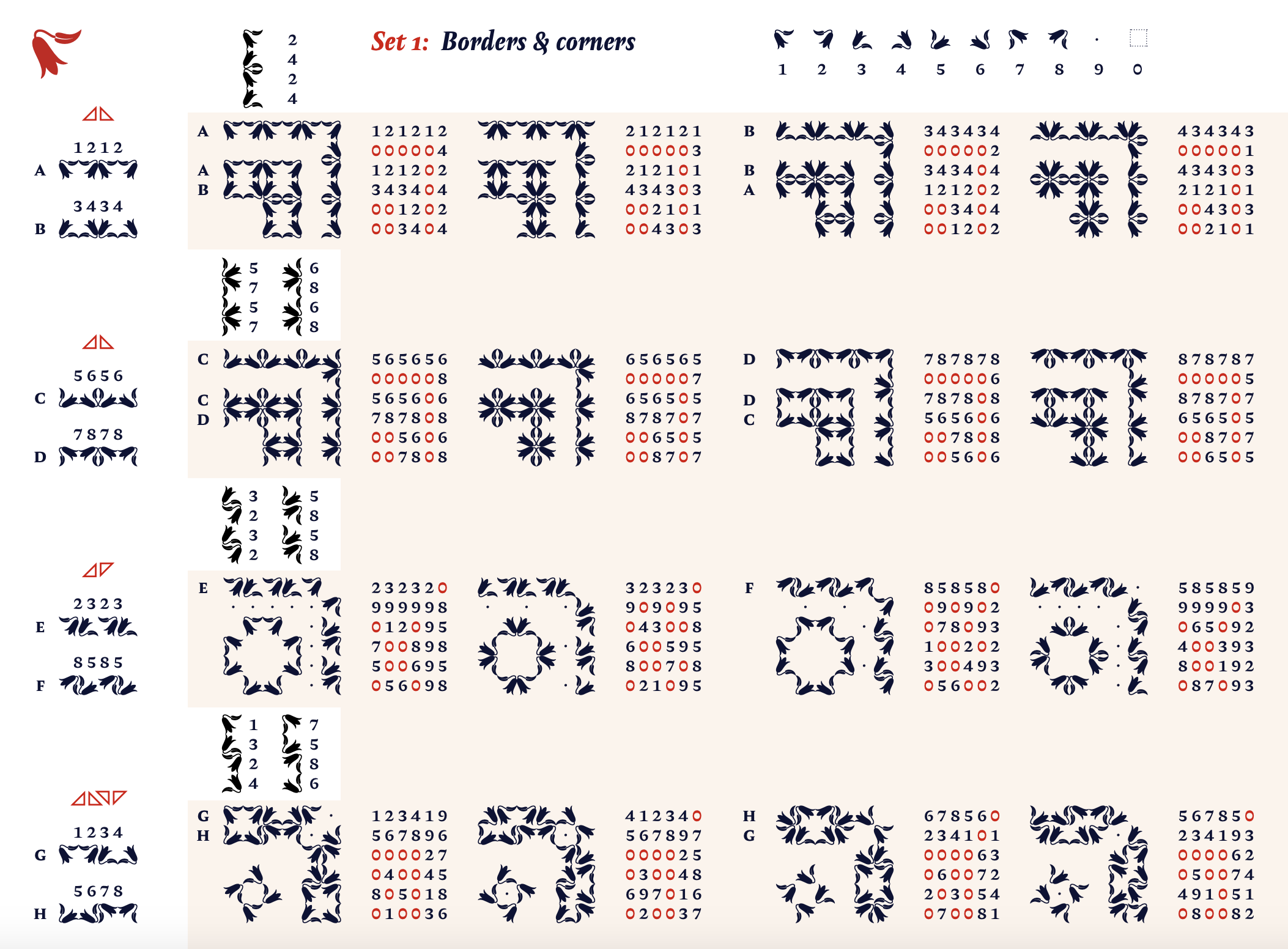
The wonderful thing about Amster is it is so much more than a font, it’s a whole type family. Since you’re reading this blog, you’ve no doubt noticed the gorgeous illustrated drop caps that feature under section headings. These drop caps are really special, not only are they intricately illustrated with characters based off of Chilean printed news sheets from the 19th century, but they have a foreground and background, which allows two-tone colors, and there are two varieties of each glyph. But the fun doesn’t stop there; Amster also includes two sets of illustrated flower glyphs, based on the copihue, a flower endemic to Chile. These glyphs are easily tessellated into borders, which you can see in the large header designs on each of the pages of this site.

I went through at least three sans serif fonts to pair with Amster. This was especially tough since I knew my eventual pick needed to have small caps*, a feature that is sorely lacking in many sans fonts. After faffing about with a bunch of mediocre geometric sans faces, I came to my senses and realized the perfect candidate was one of my all-time favorites, Alegreya Sans from Huerta Tipográfica. It’s got my coveted small caps, it has a wonderful calligraphic flare that complements Amster, and incredibly, it’s open source.
Building a website with Hugo
My old website used the Blogdown R package, and my experience with Blogdown has been so wonderful that I wanted to keep using it for my content management. Blogdown integrates with Hugo to build a static website. I had experience using Hugo themes, but for this project I knew I would need to customize my own theme. I looked around for themes that I might be able to mold or adapt to my purposes, but in the end, I’m a control freak and I could only get what I wanted by building my own theme from the ground up.
Hugo uses a system of Go HTML templates to render content. Initially I was somewhat mystified by how Hugo figured out how to render all the content. What ended up helping was taking a simple theme like Yihui Xie’s Xmin and inspecting the templates closely. After looking at the templates and content, try looking at the /public folder, which is where Hugo renders the content from templates to what will actually be displayed on your website. The language of Hugo templates is rather straightforward. Since my website was only meant for me, and I don’t really mind writing HTML, I took a lazy approach, and eschewed complex templates in favor of something simpler but with some more raw HTML. This means the theme isn’t very customizable or reusable for others, but that’s fine since it’s only for me!
After writing all of my Hugo templates, I had a very functional, but very ugly website. The fix, of course, was some CSS…actually a lot of CSS. One of my big flexes for this website is that is uses no JavaScript. I also chose not to use a CSS framework, so it came down to writing a lot of custom classes, and let’s just say I learned quite a bit about CSS in a short time.

Stylizing blogdown
There were a few tricky bits in integrating blogdown with my custom styles. The aforementioned drop caps were particularly annoying, since the foreground and background glyph must be perfectly aligned and floated and spaced properly. Like I mentioned before, I don’t mind writing HTML, and since you can write HTML in Rmarkdown, I just chose that solution and came up with a couple of classes to handle the drop caps and small caps lead-ins. The same approach was taken for the side notes, which I’m quite proud of. Initially I had looked into Hugo shortcodes, but as it turns out, using shortcodes in blogdown requires you to call a special function and ends up being much more work than just writing <aside>, so I simply wrote some CSS for the shortcodes in the aside tags and I use those in my Rmarkdown files to wrap any side notes.
Highlights, lowlights, and the future
Ultimately, I’m extremely pleased with how the site turned out, and quite proud of how I pulled it off, but along the way I struggled with a lot of aspects. I went through countless iterations of the home page, none of which felt right, before my Dad suggested that I use some of my generative art. I also had a tough time trying to troubleshoot browser or device-specific bugs, a couple of which still exist. Some highlights for me are the timeline on my about page, which I think is a really nice personal touch, and something where the implementation and design are seamless from desktop to mobile. I also quite enjoy the little bird glyphs that I’ve scattered around, they’re so cute I can’t help but smile when I look at them. I’m also proud of the responsiveness. Based on my tests, I think the site looks just as lovely on every size of device, and that was something I worked hard to achieve.
But the site is not without fault, and I do have several improvements planned. First and most important is accessibility. Currently my efforts on that front are pretty paltry, and I plan to go through and revamp my HTML so that the site works better for more people. Performance is another area that I think could use some work. The site is quite fast as it is, but it contains a lot of images and large font files which cause loading slowdowns on some pages. I did a lot of work on performance, including resizing and compressing about 200 images, spending hours and hours on preloading techniques and font massaging, but there’s still more squeezing I could do to make the site even snappier.
I hope you like the site, and I hope this post gave you some inspiration if you’re thinking about redesigning your own site or learning Blogdown/Hugo. My biggest realization from this project was that building a performant and highly functional website doesn’t require big JavaScript frameworks or lots of fancy coding. If you are willing to put in the time with a little bit of HTML and you can be patient and savvy with your CSS, making a site like this is within reach.
