Font height differences between Windows and Mac
November 10, 2019
What’s the matter?
Look, I didn’t ask to be here, but yet again I’ve gone down a rabbit hole of weird things operating systems do to fonts, and I don’t want anyone else to have to spend four hours trying to solve this, so here we are. Previously, I wrote about the train wreck that is trying to use custom fonts with ggplot on Windows. Today I’m back with another tale that will have you raising your fist to the sky and screaming ”Why is there no universal specification for font rendering!?!?!?” But this time we’re moving out of Rstudio and into the World Wide Web, with a story about how font height and alignment varies between operating systems and web browsers, and how to fix all these problems.
Being a developer who uses both Mac and Windows causes me quite a bit of pain, but on the bright side, it also exposes issues that I may never have known of if I were just blithely strolling down the path of Mac happiness. For example, today I switched back over to my Windows machine after a long sabbatical on my Mac, and I noticed that the drop-caps on my website were misaligned. Specifically, they were about 10 pixels too high, so that they stuck out above the top of the paragraph.
I knew almost immediately that this had to be a Windows-specific bug. These drop-caps involve two separate glyphs to get the two-tone foreground and background, and the CSS was one of the trickiest parts of my website to pull off, so I’ve probably spent more time tweaking and troubleshooting and testing these drop-caps than anything else on my site, which means there was no way it was something silly I overlooked.
The solution
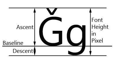
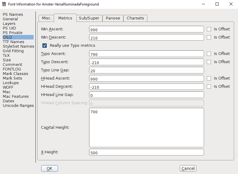
After reading through a few stackoverflow threads, I decided the problem might be in the vertical metrics of my font files. To understand what this means, let’s talk a little bit about how fonts are measured. The first concept is the “em square”, this is simply a box which has a width and height of 1em, what is an em? Simple, 1em equals the point size of the font, so for a font at 24 pixels, the em square is 24x24 pixels large. The baseline is the bottom of where we start drawing glyphs, and lies at the bottom of the em square. The ascent is the distance from the baseline to the top of the tallest glyph, so typically 1em. The descent is the distance from the baseline to the lowest point in any glyph. The descent can be different because on web fonts, glyphs like g or p can have tails that extend below the baseline.
So, what does this have to do with our problem? Well, Windows and Mac each have their own specification for the ascent and descent values. On a Mac, a font looks for the ascent and descent in something called the HHead table, whereas on Windows, a font looks for these values in the Win table. Perhaps you’ve guessed by now, that these tables can have different values for the ascent/descent of the same font, leading to different vertical alignment on Windows and Mac machines.
The stackoverflow threads all suggested use of fontsquirrel, which is a free font generator to automagically fix these problems. Unfortunately, this did not work for me, as fontsquirrel only allows you to edit open-source fonts, and I was using commercial fonts (I also find their tool frequently bugs out and just refuses to work). So, I turned to the next solution, manually editing the vertical metrics tables using FontForge. FontForge is an open-source font editing software, and it was fairly easy to do what I needed. I opened my font file (it doesn’t matter what format), then went to Metrics > New metrics window, in the metrics window, select Element > Font info…, this opens a new window, where you can navigate to OS/2 > Metrics. Here you will see the values for Win Ascent, Win Descent, HHead Ascent, and HHead Descent. In my case, Win Descent was different from HHead Descent, so I changed Win Descent to match the other values. When you’re done editing, you can go back to the main window, go to File > Generate fonts and export your edited font as WOFF, WOFF2, TTF, or whatever you like.
Bonus bugfix
Editing the Win Descent in the font files fixed my Windows problem, and I noticed it also changed how the font rendered on Android devices. Previously, I had seen that on chrome on my mobile device (but not in chrome devtools on my Mac) there was a misalignment of the drop-caps. I anguished over this for ages, unable to understand why chrome on my Mac was different than chrome on my Android, until I implemented a band-aid solution. Now I realize that the reason is that Android uses the Win table for font metrics.
A firefox surprise
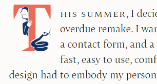
Of course, OS-specific bugs weren’t enough, so these drop-caps decided to bestow me with a browser-specific bug as well. I have had a long-standing battle with Firefox over the alignment of my drop-caps. The foreground and background glyphs have always been slightly misaligned, and I could never work out the proper patch to fix it. But after my font metric fix for Windows, the Firefox alignment hit the fan, so to speak. Here’s an image of what I saw after editing my fonts.
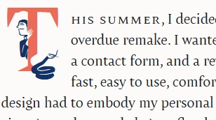
Now I had one of the drop-cap glyphs properly aligned (the blue) and the other bumped up so that it was misaligned with the paragraph and the foreground glyph. At first, I thought I had screwed up one of the font edits, since only one of the two glyphs is misaligned, but I double checked them all and it was fine. Ultimately, I couldn’t come up with a good explanation, so I did a very bad thing you should never do but I’m still going to tell you how. You can target Firefox with a little CSS hack (that may or may not stop working someday, and is dangerous to use). So, I came up with a simple rule that pushed the misaligned glyph back down to where it needed to be. Here’s how you do it.
@-moz-document url-prefix() {
  .drop-cap::first-letter {
    padding-top: 12px;
  }
  @media (max-width: 500px) {
    .drop-cap::first-letter {
      padding-top: 10.5px;
    }
  }
}A postmortem
If you’re still reading this, congratulations, and thanks for your dedication. I hope you learned something, or perhaps this even helped you solve a similar problem. For me, this was very much a problem -> solution kind of post, but there’s a lot of questions I left unanswered. Like, if fonts have different Win Descent heights, then is all of the text on a Windows machine misaligned? The rest of my layouts look OK based on a cursory glance, so why was this one so noticeable? Perhaps it was just because the drop-caps are so large so the difference was accentuated, or maybe only certain fonts have this Win Descent difference and the other ones are fine. It definitely opens up a whole can of worms that I’m not sure I want to get into right now, but perhaps another day I will dig into all of my font files and see what happens if I start harmonizing the vertical metrics for everything on my site. Who knows, maybe everything on the web is actually slightly misaligned on Windows (or on Mac, depending on your perspective), and you’ve just never noticed… that’s fodder for a horror movie if I’ve ever heard it.