Disintegration (12 Months of aRt, October)
December 21, 2019
Inspiration
Perhaps you’ve noticed that the date on this “October” blog is December 21st—the reason is that life happened. In October and November of this year, I got sick for two weeks, had to sprint to finish my NatGeo Ocean Plastic Innovation Challenge (the largest project I’ve done to date), changed jobs, had to travel for several weeks, switched computers twice, and had my usual freelance workload. Which is all just a big long excuse to say, I’m sorry. I really wanted to have these blogs all done on time, but recently something had to give. I sincerely hope to have November and December published before the end of January. Now onto the actual art!
I think the inspiration for this one was subconscious. I was watching His Dark Materials (great show by the way), when I got the image of shapes disintegrating into dust and being carried away by the wind. After thinking about it for a while, I realized there’s some parallels with Thomas Lin Pedersen’s now famous series of geometric shapes seeding flow fields with particles. I guess it’s this contrast of hard lines with softer random particles that got me started on this track, but regardless, it turned out to be much trickier than I anticipated. This post will not go into gritty detail of how my code works. The reason is that this project sort of spiraled out of control as I encountered bug after bug that I had to patch in weird ways, with the end result that I don’t think anyone besides myself could really understand how it works, and I’m not even sure if others can use it without great effort. Instead I will give an overview of my thought process and how I went about breaking down this problem into smaller pieces and solving each piece.
Drawing shapes
The first thing we need for this algorithm is a set of functions to draw shapes. I wanted to be able to draw straight lines, circles, and regular polygons of any number of sides, and all of these should be made up of a series of points so that we can later make those points drift away as if they were disintegrating. To draw a line, you just need two points, and then you can interpolate any number of points between them. To make it interesting and add some randomness, I borrowed the sand_paint() function from Marcus Volz’s mathart package for line drawing.
#generate random points between endpoints for a set of edges
sand_paint <- function(edges, n_grains = 100) {
  # Function for sand painting a single edge
  sand_paint_edge <- function(edge_num) {
    a <- as.numeric(edges[edge_num, c("x", "y")])
    b <- as.numeric(edges[edge_num, c("xend", "yend")])
    data.frame(alpha = runif(n_grains)) %>%
      dplyr::mutate(x = a[1] * (1 - alpha) + b[1] * alpha,
                    y = a[2] * (1 - alpha) + b[2] * alpha) %>%
      dplyr::select(-alpha)
  }
  # Sand paint all the edges
  1:nrow(edges) %>%
    purrr::map_df(~sand_paint_edge(.x), id = “id”)
}
Circles involves a bit of trigonometry to lay out a set of points around a circle. But this was a breeze after my circle drawing extravaganza in April and May.
#draws a circle with radius R and number of points `points`
circle <- function(points = 10000, r = 30) {
  tibble(angle = seq(0, 2*pi, length.out = points), x = r*cos(angle), y = r*sin(angle)) %>%
    mutate(id = 1:nrow(.)) %>%
    select(id, x, y)
}
Drawing polygons was the hardest, because I needed to allow for any number of sides, a center around which it should be drawn, and it needed an angle of rotation (so you could have a square or diamond, for example). The solution is fairly similar to the circle in the end: take the number of sides, and draw that number of points evenly spaced around a circle. But then we interpolate between each set of points to fill it in with the desired number of points for the total shape.
#draw a regular polygon with number of points `points` and some radius r, number of edges, and at angle `start_angle`, centered at (cx,cy)
regon_pts <- function(points = 10000, edges = 3, start_angle = 0, r = 10, wind_angle = 0, cx = 0, cy = 0) {
  a = start_angle * (pi / 180)
  n = floor(points / edges)

  #lay out the corner points
  corners <- tibble(angle = seq(0 + a, 2*pi + a, length.out = edges + 1), x = r*cos(angle) + cx, y = r*sin(angle) + cy)

  edges_list <- list()

  #for each edge, interpolate the points between the corners
  for(i in 1:edges) {
    edges_list[[i]] <- tibble(id = 1:n) %>%
      mutate(d = id / n,
             x = (1 - d) * corners$x[i] + d * corners$x[i + 1],
             y = (1 - d) * corners$y[i] + d * corners$y[i + 1])
  }

  bind_rows(edges_list)

}
Blowing in the wind
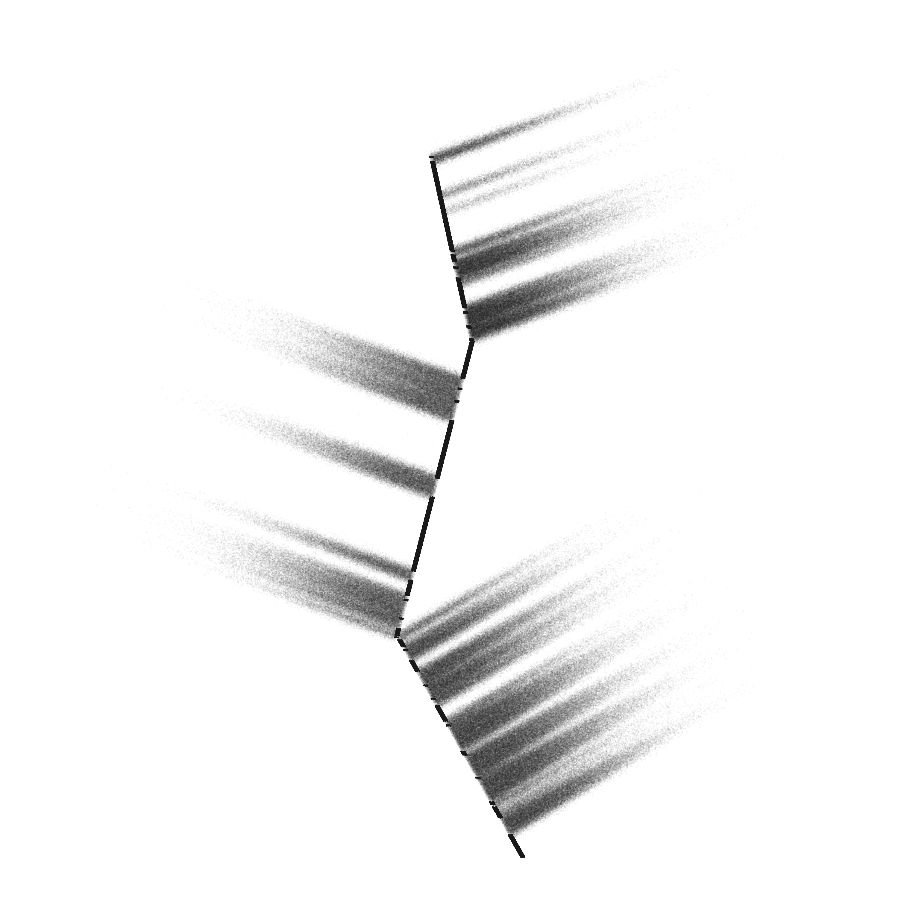
Now for the hard part. So what are we going for here anyways? Let’s say we have a simple vertical line of points, like we could draw with our line functions. I want to be able to take that, and apply a force like a gust of wind blowing against it that will displace some sections of the line and scatter the points out as if they had been blown away by the wind. This ends up pretty confusing when coded, so let’s lay out the steps we need first.
- We start with a set of points in some shape (we’ve covered this already)
- We split up that shape so that sections of it will move and others won’t. To decide which move I will define a value called
intertiafor each point, that will modify how easy the point is to move. An inertia of 0 means the point doesn’t move at all*, and points with higher inertia will move more. Randomizing this value makes sure that our points will be nicely spread out, not all moving the same distance. - We apply a force to the points (I think of this as our gust) this force has some magnitude (how far it will push the points) and some angle (the direction the points will move). It will be modified by inertia and some random jitter we will add.
This doesn’t sound too bad, and it wasn’t, but then I had to go and make things complicated…
Allowing denser shapes
When we go to plot these, we will use a pretty small point so that the particles look like dust, rather than big bulky dots. A consequence of this is that the remaining part line or shape that doesn’t move ends up looking very thin with almost no depth. I wanted to be able to control how dense a shape looks. I planned to just stack a few lines next to each other, close enough that they look like one big line. This works, but it introduces a problem. Our algorithm randomly decides which points will move and which won’t, meaning that we end up with a set of lines next to each other, but the gaps in them don’t line up. Here’s what the glitch looks like:
The fix for this is to decide ahead of time which points will move—generating a “seed” shape—and then join this with the rest of the shapes later on. You’ll see how I ended up doing this in the code with functions to generate seed shapes, which are then joined with the actual shapes through a function called splitter2().
Fraying
In an attempt to make the shapes look more realistically like they were disintegrating, I thought it would be nice to “fray” the ends a bit. What I mean is that when you have these gaps between points that move and those that don’t, they look very sharp, since it’s a perfect barrier. This didn’t feel quite right to me, since I imagined that a material that’s actually disintegrating would have little bits and pieces coming off at the end sort of like a rope that is fraying, rather than a perfectly sharp transition, like a rope that was cut with scissors.
To achieve this effect, I take each set of points that move, and sample points from the ends in a defined way, setting their inertia to zero, or a random value. This is basically doing the same thing as the overall algorithm, but at a much smaller scale only on the termini of the transitions. All you have to do here is take a “split” set of points and pipe it into fray(). You can set how many gaps you should have, and how long or short the gaps should be.
Controlling the spread of points
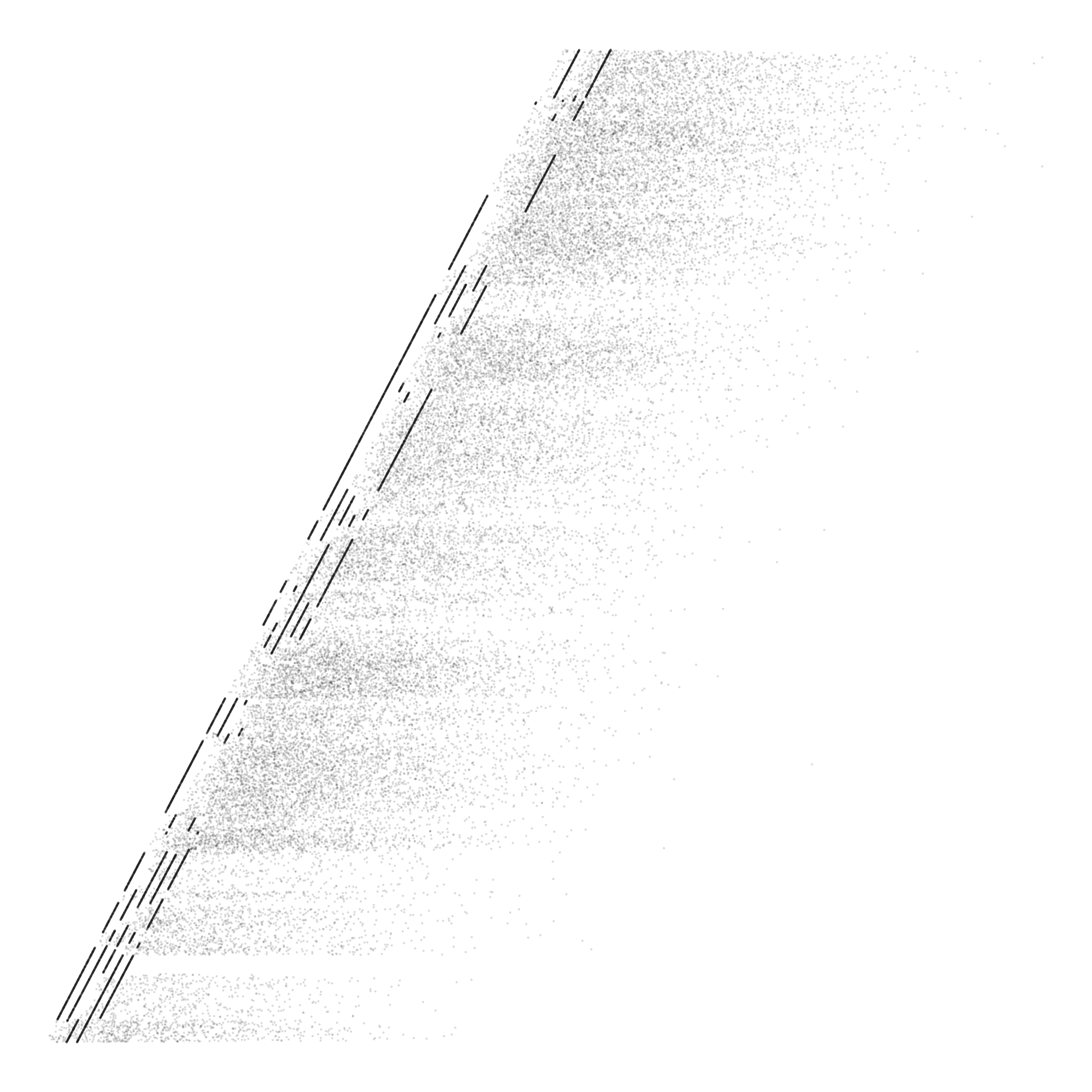
All of our effort to this point allows us to make shapes look like they are disintegrating in the wind, with one snag: the points that are disintegrating and moving away will form a perfect rectangle. With actual wind you would expect something more organic, like the points sort of tapering inwards to a point (perhaps due to a strong wind), or maybe even spraying outwards. Achieving this kind of look was a monstrous task for a non-math-whiz like myself. To get this to work with controllable parameters on every type of shape and in every direction took about 2 weeks of blankly staring at my code and scribbling trig diagrams in my notebook. This is all to say that I’m not going to give a detailed description of how I pulled this off, because it would be a giant post by itself, and it’s probably not a good way to do it anyways. But here’s a brief overview.
Imagine we have a line of points, we’ve gotten them to move outward in some direction, but they’re in a rectangle and we want them to slightly taper as they move further outwards. My solution here is to move the point slightly inwards, toward the middle of the set, in a direction perpendicular to the “gust direction”. So, for each point we calculate how far it is from the center of the set, then use this distance as a modifier when moving them towards the center (further points move more than points that are already near the center). To get a tapering as the points move further out, we also modify our movement by the inertia value, which you will recall, defines how far the points should move in the gust.
In the code the important parts are the wind_angle parameter which you need to provide to the *_seed() functions and splitter2(). The reasons for this one are complicated, but it ensures that this works for all shapes and directions. The wind_angle must match the angle in the gust() function. Then in the gust() function, you can set a diff_mod and inertia_mod. These parameters control the amount and shape of the spread. You can make them larger or smaller, positive or negative and the spread will change. You can also modify the jitter parameters to affect how much randomness there is in the spread.
A recipe for success
Even though the guts of this code are pretty non-intelligible, I want to give an example of how I make the art for this month, and using the high-level functions is a bit more realistic. Here’s how I would make a circle that is disintegrating with a downward gust.
library(tidyverse)
library(EnvStats)
library(zoo)

#generate a seed for our circle with 50000 points and a radius of 50
#the `split_mod` parameter controls how many gaps the circle will have, a higher split_mod gives fewer splits
circle_seed <- gen_seed_cir(n_grains = 100000, wind_angle = 270, r = 50, split_mod = 2500)

#generate a list of 5 circles, each one slightly larger than the previous
circles <- list(a = circle(100000, r = 50),
                b = circle(100000, r = 50.25),
                c = circle(100000, r = 50.5),
                d = circle(100000, r = 50.75),
                e = circle(100000, r = 51)
)

#split circles and fray the edges
circle1 <-
  circles %>%
  map( ~ splitter2(., seed = circle_seed, wind_angle = 270)) %>%
  map_dfr( ~ fray(., min_fray = 100, max_fray = 200, num_fray = 5))

#scatter points according to force and angle
#diff_mod, inertia_mod, and jitter_mod control the shape and look of the points scatter
circle_dust <- gust(circle1, angle = 270, force = 4, diff_mod = 0.006, inertia_mod = 0.0009, jitter_min = 2, jitter_max = 20, jitter_mod = 0.4)

#plot the points with a low alpha and size
ggplot(circle_dust) +
  geom_point(aes(x = x, y = y), alpha = 0.04, size = 0.1, color = "#1e1e1e", shape = 46) +
  scale_color_identity() +
  theme_void() +
  coord_equal()

#ggsave("circle_1.png", height = 10, width = 10)
`“

<img src="/img/blog/circle_post.png">

As always, the code for this month is up <a href="https://github.com/will-r-chase/aRt" target="_blank">on my GitHub</a>. If my code is not entirely clean, I hope this post at least provided some inspiration and a look into how I go about breaking down and thinking about problems. And if nothing else, you can enjoy these pretty pictures, the fruits of my labor this month.

<img src="/img/blog/two_squares.png">
<img src="/img/blog/regons_3.png">
<img src="/img/blog/tri_1.png">