
Why I'm not making COVID19 visualizations, and why you (probably) shouldn't either
March 31, 2020
While I write this post—from lockdown during a shelter-in-place order—the novel coronavirus SARS-CoV-2* is spreading across the globe at an unprecedented rate. Along with the virus, there’s been an accompanying spread of visualizations. However, I have been conspicuously quiet on the subject, until now. Not to brag, but compared to most visualization experts, I think I’m pretty qualified on the subject. I did my undergraduate degree in microbiology, where I focused on virology, microbial evolution, and epidemiology of infectious disease. After graduating, I worked as a research analyst for an epidemiologist where I focused on data analysis and visualization of epidemiological studies. Since then I’ve become a full-time data visualization specialist.
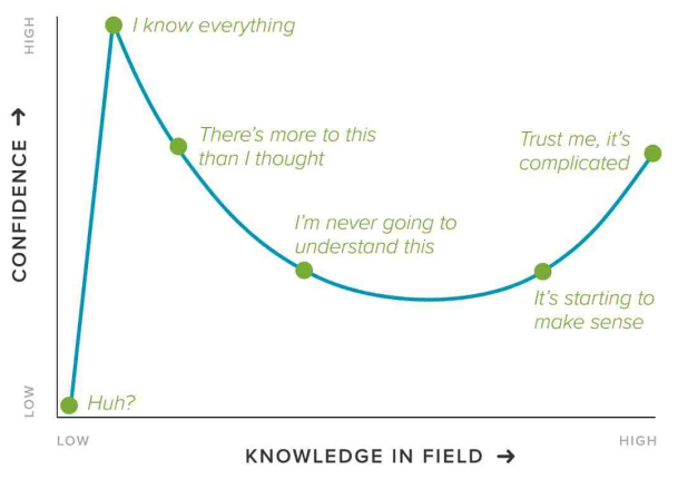
So why haven’t I joined the throng of folks making charts, maps, dashboards, trackers, and models of COVID19? Two reasons: (1) I dislike reporting breaking news, and (2) I believe this is a case of “the more you know, the more you realize you don’t know” (a.k.a. the Dunning-Kruger effect, see chart below). So, I decided to watch and wait. Over the past couple of months I’ve carefully observed reporting of the outbreak through scientific, governmental, and public (journalism and individual) channels. Here’s what I’ve seen, and why I’m hoping you will join me in abstaining from analyzing or visualizing COVID19 data.
Why this matters
The COVID19 pandemic has captured international attention more widely and more completely than any event since 9/11. People are afraid for their lives and desperate for information. This creates a dangerous scenario where data visualizations on the topic will have unusually high exposure to the public, and visualizations that communicate a misleading or incorrect message can cause real world harm.
Let’s pretend for a minute that you somehow have access to perfectly accurate data (currently impossible). The incredible social media signal boost that COVID19 visualizations will receive means our charts will be seen by an unusually broad audience, likely lacking in graphicacy. Without very careful consideration of the graphicacy level of your new audience, your visualizations are likely to be misinterpreted.
What happens when your chart is wrong or misinterpreted? If you overshoot your estimates (of death, infections, etc.) in the best case, it will cause undue stress and anxiety to those that read it, and in the worst case it will cause mass panic and perhaps even incorrect allotment of government resources. If you undershoot your estimate, you could cause a false sense of security, people may think it’s OK to resume their daily activities, organizations and governments may not take appropriate action—now you’ve caused deaths. In any case, you’ve spread misinformation, and even if it doesn’t topple governments, it can cause confusion and contribute to diluting the opinions of experts. Ordinarily this would be a great embarrassment, as dataviz experts are supposed to be sources of truth. But now things have changed, many people have died, more will die, and your visualization could make it worse.
But what if you could get it right? What about #FlattenTheCurve? Isn’t this an opportunity for dataviz to inform the public and help save lives? Yes, this is a time for dataviz to shine—see the section below on what you can actually do to help. Unfortunately, of the hundreds of visualizations I’ve seen on the subject, only a tiny fraction fall into the helpful category. The vast majority of projects I’ve seen focus on case numbers, death numbers, mortality rate, epidemiological projections, virus spread, or other facts and figures on the outbreak—and they’re all wrong. Let me be clear, no one can accurately report these statistics, it’s not possible. Even some of the wonderful charts from the FT, wrong; the NYT, wrong; the WHO, wrong. This does not mean that no one should report these statistics, in fact, all of those organizations I mentioned above have done great work trying to communicate what we know, and more importantly, what we don’t know. When I say all of these visualizations are wrong, I don’t mean that these outlets are making mistakes or purposely lying. The charts report our best estimate based on imperfect data. But to get that data to any reasonable level of accuracy takes great time and resource investment, and communicating the uncertainty effectively is equally as difficult. If you’re thinking about doing a project with COVID19 data, first ask yourself: Can I do better than these huge organizations and the top experts on public health? If not, then promote the work of experts instead of creating your own inferior and potentially harmful version. With the stakes as high as they are, and with the state of the current data on the outbreak, this kind of reporting should be left to the experts, not used as a fun weekend coding project.
Why all these COVID19 charts are wrong
Here’s a very basic question about the COVID19 outbreak: How many infections were their in Wuhan, where the virus originated? Answer: no one knows. There’s two main problems that contribute to this: (1) a lack of widespread testing, and (2) that many people (perhaps even a majority) who are infected are asymptomatic and will never know they had it. These uncertainties pollute many related measures. For example, you can’t accurately calculate mortality rate without case rate. Many epidemiological models will fail without this information, and it complicates our understanding spread severity.
Perhaps the most accurate metric we have is number of deaths (number, not percentage!). This is why many of the top outlets like the FT are relying pretty heavily on number of deaths in their reporting. However, even these numbers are estimates. There are several issues with the accuracy and completeness of data on numbers of deaths in various countries, and there will always be cases that are either misdiagnosed or unable to be caught.
And forget about trying to make models or projections of what our future will look like. These types of models rely on dozens or even hundreds of variables, very few of which we know accurately. Please leave modeling to the academics, who will be the first to admit that their models have massive confidence intervals and should be interpreted with great uncertainty. The difficulties are best described in this excellent article from fivethirtyeight.
Even basic scientific facts about the virus remain unknown. How does the virus tolerate heat? How does the virus shed? How might the virus mutate? Do people develop lasting immunity to the virus? Ask the experts and all of them will say: “We don’t know.” Good science takes time, and we will have to wait for good answers to these questions.
Problems with interpretation
Even when we do have decent data (number of deaths, for instance), it’s very tricky to communicate effectively. Here’s an example. If I, as a reader, look at the number of deaths in my area, what does this mean to me? What my brain really wants to know is: how freaked out should I be? So if my area has a lot of deaths, I’m now sufficiently freaked out, there’s a good chance I could die! But no, incorrect interpretation, because I’m young and healthy, and the virus is more deadly for older people with preexisting conditions. Ahh, so I can relax, I’ll be fine. No, wrong again! Although the probability might be lower, I’m not immune by any chance, and the virus has killed many young healthy people. So maybe I should be medium worried? These types of distinctions and subtleties are tricky to understand. Even for someone like myself, with a background in science, microbiology, and data analysis, my rational brain and emotional brain struggle to find common ground when looking at these charts.
And if you think a little deeper, things come apart at the seams. I live in Philadelphia, which is densely populated, did the chart I’m looking at correct for population density? And that whole thing about mortality being worse in older people, I wonder if they corrected for age stratification in my area…is that even possible without accurate mortality rates? Did they correct for prevalence of preexisting conditions, maybe in the form of air quality data or asthma rates? And of course we should consider healthcare: the number of hospitals, ventilators, and access to medical care will skew our estimates too. I could keep going, but you get the idea. These issues may not affect the accuracy of the reported number of deaths but as a reader, you don’t really care about number of deaths, you care about how likely it is that you or your mother or your sister will die*, that’s the mental leap your brain makes when looking at these charts and that’s what is so skewed from all these issues.
Who should visualize COVID19 data?
All of this boils down to a few key points: the stakes are literally life or death; the data is patchy and poor quality; the data is likely to be misinterpreted, even by educated people. This means anyone wishing to report on COVID19 statistics should be working as a team, to ensure multiple people to bring up issues and spot mistakes. That team should include experts in gathering and validating complex and messy data from numerous sources, experts in public health and epidemiology (or at least consult with these experts), and master communicators who understand how to effectively show uncertainty in the data and guide readers to the most correct interpretation. There are teams like this, who are doing excellent work trying to keep the public as informed as possible with uncertain data and in uncertain times. In particular I want to thank the FT, NYT, and SMCP graphics teams for their coverage.
It also means this is an issue that demands great time and attention. One reason I have not published anything on COVID19 is that I don’t feel like I have the time it deserves to do a thorough job and get it right. This is not the kind of project you should try to slap together in a weekend or work on as a side project. However, if you just think the data is interesting, and want to practice your analysis or visualization skills, there’s no harm in downloading some data and working on it on your local machine. The danger comes when you decide to share that with the public. If during the course of your investigation you think you find something novel, share it with a subject matter expert and get their opinion, or perhaps approach a newspaper or local/state health department to see if this is something that can help them. And when working with this data, be sure to follow these important considerations when working with COVID19 data, from Nightingale and Amanda Makulec.
What you can do to help
If you are a data scientist, developer, or visualization expert, there is a lot you can do to help with the COVID19 outbreak. Here’s some tips on what to do:
- If you’re thinking about doing something with data on case load, deaths, spread, building a dashboard, online tracker, or other doodad that has to do with COVID19 statistics, please stop what you’re doing and close your code editor. If you just want to practice working with this type of data, then continue to do so in private, but please don’t share your unverified work publicly. If you think you have found something novel, share it with a subject matter expert to get their opinion before publishing.
- Maybe you’re appalled by the ugly design and bad UX you see from expert sources, here you can help! If you’re a designer, reach out to academics and other official agencies to offer them your help for free. You can provide storytelling advice, UX/UI redesigns, and other tips to help the experts more effectively get their message across.
- You can focus on smaller stories. We may have great uncertainty about the large-scale statistics, but telling smaller or more individual stories is an excellent way to get people informed, connect with your readers on a more emotional level, and avoid data pitfalls associated with things like case numbers or mortality. You could pick up the phone and call local restaurants to ask how this has impacted their business. You could go out on the street and count the number of people out and about in various neighborhoods (of course keeping a safe distance yourself). Here’s an excellent example from the Washington Post about the job losses on a single block in DC.
- Make visual explainers to emphasize the key things we know people can do to prevent illness. Visualizations of how social distancing works, or diagrams of areas people typically miss when washing their hands are great examples of recent visualizations that have had a huge impact on improving the way people behave during this outbreak.
- Use your skills to help those on the front lines. I’ve seen recent projects built by data scientists and web developers to coordinate the donation, pickup, and dropoff of masks, gloves and other personal protective equipment to hospitals in need. If your local hospitals are struggling, think about what you could do to facilitate donations of critical supplies.
- Help people feel better. We’re all affected by this outbreak to varying degrees, but one thing that’s universal is we’re all stressed, anxious, and scared. Take this time to make that visualization about your favorite TV show or movie or book. Make something fun and lighthearted that will help distract people and give them a break from the onslaught of terrifying news filling up their feeds. For example, after reading this you probably need a pick-me-up, so here’s a chart I made on Seattle’s least popular pet names.