Introducing Graticule, an app for making frustration-free maps
June 3, 2026
Graticule is an application for making frustration-free maps. I made it because I love maps, but the process of making them often leaves me wanting to tear my hair out.
Here’s how you’d like a mapping process to go:
- Find some data you want to map, import it into a software like QGIS
- Add some basemap features like a coast line, land, elevation, etc.
- Style your basemap and your feature of interest
- Export it. Success!
But more often than not, here’s how it actually goes:
- Find some data you want to map, hm it’s not showing up as expected.
- Spend 30 minutes figuring out there’s some odd issue with the CRS or antimeridian clipping. Boot up GDAL (aka spend an hour waiting for homebrew to update) and run it through ogr2ogr to fix the issues
- Import to QGIS. It has some extra features you want to delete and some properties you need to edit so it’ll eventually be styleable. QGIS feature editor is inscrutible so upload it to a tool like geojson.io and make your tweaks.
- Reupload to QGIS, and bring in some basemap data you have to download from Natural Earth. Damn, the coastline of the Natural Earth data doesn’t quite line up with the coastline of your feature.
- Try to do some weird combination of clipping and dissolving and manually stitching things together to get it to look ok.
- Now you realize you need to simplify the linework because it’s too detailed for the scale you’ll be rendering it. Bring it to Mapshaper and run a simplification.
- Now your simplification has left it with some angular features, but you want a more blobby aesthetic. Run a line smoothing algorithm in QGIS, but now this causes adjacent polygon borders to pull away from each other leaving odd gaps. Give up on the smoothing and move on, it’s getting late.
- Style your layers, then realize you need labels. Desperately try to render labels in QGIS, but the formatting isn’t right, shit!
- You have nearly a hundred labels, not going to do them all manually. Find a lookup table in R, try to remember how to import your feature using sf and join the reformatted labels back in. Fail a couple times to reexport.
- Eventually get it working in QGIS. The labels kinda look like shit and you don’t have time, so export the whole thing to SVG and do a bunch of manual cleanup in Illustrator.
- Go cry in the bathroom stall.
It was issues like this—times when I’d spend a full day working on a seemingly simple map, bouncing between a half-dozen tools, and still not be satisfied with the result—that drew me to Mapbox.
Trying Mapbox for the first time was a revelation. It felt like my whole cartography process up until now I had been Indiana Jones, fumbling through a dark tunnel full of booby traps, stumbling and barely avoiding a spike pit, and Mapbox was like making it to the end of the tunnel, emerging into a bright landscape with a single clear pathway guiding me towards my destination. Everything in Mapbox just worked: coastlines lined up with oceans which lined up with land polygons; I could add beautiful terrain shading with a single click; styling was a breeze; and it was fast.
But Mapbox was built specifically to render web maps (though I have to admit, I made many a static print map by screenshotting from Mapbox). And later it became unaffordable for projects that fell in the middle of the hobbiest to corporate scale (read: newsroom).
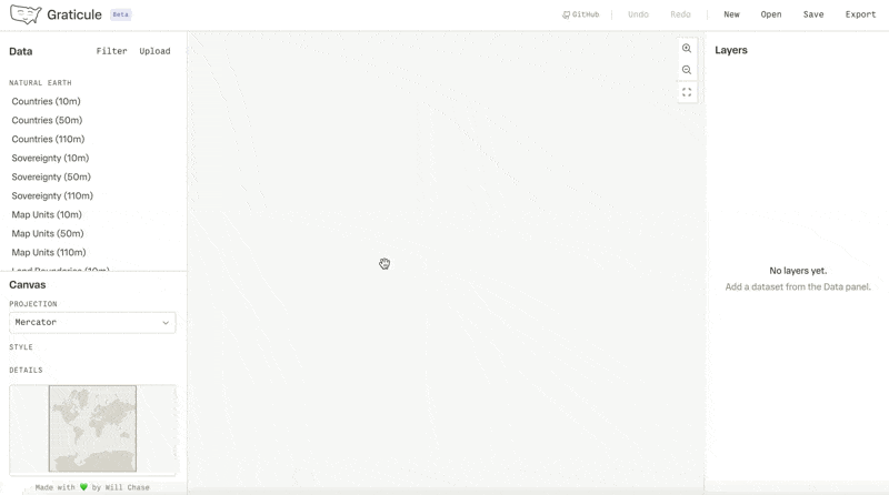
Enter Graticule
Over the years making maps got slightly easier—not because I ran into fewer issues or fewer steps, but because I developed a bag of tricks to fix them. Graticule is my attempt to share those tricks with you. It’s the app I wished I had all those years ago. Something with the intuitive UX and fluidity of Mapbox but designed for vector mapping, something that could get me a map in 30 minutes rather than an afternoon, something that just worked.
Why now?
Graticule began as a simple idea: what if I made a little web tool to formalize some vector smoothing techniques that I had cobbled together in various notebooks and code snippets? But I’m a person with a job and a house and a dog, so that idea floated away into the ether.
Then, the entire world lost its mind. All of a sudden, every single post on LinkedIn was about how design was dead, engineering was cooked, and software was doomed, because AI would replace it all. I believe all of those statements are bullshit, but it is true that in the latter half of 2025, AI got good at writing code (more nuance on this in a later blog post). By this time, I had been designing AI-powered workflows and products at Observable for nearly a year, and I had tested AI assistance in many areas of my design workflow, where I found it mildly useful, but not life changing. But I kept hearing that it was life changing, sometimes from people I deeply respected, so I thought I needed to give this a deeper look.
As I thought about where AI might be useful, that little idea I’d had long ago about a web tool for line smoothing algorithms came floating back out from the ether. But now, with the help of AI, I realized this tool could be a lot more than just a smoothing utility, it could be a full on mapping application, it could fulfill that desire for the tool I wished I’d had all those years ago. Last year, I never would have considered building a complex app like this by myself: I’m a coder, but not a Software Engineer™. But with AI, I thought maybe it was possible. So I embarked on this project with a dual purpose, to build a genuinely useful tool that would make some common mapping workflows simple and joyful, and to test the limits of AI development—How far could it extend my skills? Could it really build a complex GIS app from scratch? Was it really as life-changing as people said?
What Graticule is today
Graticule is a web application; it requires no login or other form of authentication; it runs entirely in your browser; it does not and will not collect any data from you; and it is free and open source. In an age when software is increasingly cumbersome to interact with, I wanted to make an app where you could simply open a web page, paste in your data, do your work, and export it, without worrying about two-factor authentication codes, signing up for marketing emails, or whether your data is secure.
Today I’m releasing an MVP. It contains a lot of the basic chassis that you need in any app like this: saving projects, uploading data, rendering map features, undo/redo, changing projections, and exporting files. But the key feature in this release is the initial kernal that started the whole project: smoothing.
Smooth move
In the past, maps were drawn by hand, resuling in gentle curves that were visually appealing and kept the correct level of detail in a feature for the scale of the map. Modern GIS software uses datasets that are frequently too detailed, leaving coastlines and borders looking jagged and fuzzy, distracting from the point of the map. Cartographers often handle this by applying simplification (which Graticule also implements, thanks to the wonderful Mapshaper library). But simplification can result in a spikey or blocky appearance, not the elegant curves that beautified the maps of old.
An algorithm will never achieve the level of care and beauty of a hand-drawn map, but smoothing can get us closer. It evens out the harsh edges and rounds over spikes to approximate the curves we’d expect to see in a hand drawn map. It has been a crucial tool in my cartography toolbox for creating more elegant linework and matching the style of a map to the creative direction of a project.
Graticule implements two types of smoothing: Chaikin’s corner cutting algorithm and bezier smoothing. There’s more details about these algorithms and their usage in the documentation, but a key differentiatior in Graticule is that our implementation is topologically aware. This helps avoid a common issue that these algorithms can cause where the corners of features with shared borders pull away from each other, creating odd gaps and other artifacts. We use the topology of the dataset to ensure that this doesn’t happen, so lines get smoothed where appropriate, but shared borders maintain their coherance and odd artifacts are avoided.
What Graticule will be tomorrow
This MVP is relatively niche and limited in functionality. It begs the question: what can your tool do that others can’t? Well, the truth is: not much (topologically-aware smoothing is something I’ve struggled to find elsewhere, but I’m sure it exists). Tomorrow, there may be more features, and yet more after that, but GIS is deep water, and I’m not aiming to compete with QGIS or ArcGIS here. The idea is not to do everything, but to do a small number of things well, particularly those things that I’ve found difficult in other tools, and to make them dead simple to use. So, while I aim to leverage a top-notch UX to create something greater than the sum of its parts, we still need those parts, and I’m excited to share what they will be.
As an extremely informal roadmap, here’s what’s top of mind:
- Documentation
- Geospace exports
- Features table and interactive feature selection
- Global layer settings
- Projection wizard
- Label rendering and editing
- More datasets built in
And here’s a grab bag of other ideas I’d love to get to but have not put as much thought into: Raster support, vector drawing, support more CRS, custom projections via proj4, more smoothing algorithms, better data repair mechanisms, geometric operations (dissolve, clip, etc.), elevation data, data visualization support, GEE integration, water lines.
If you have thoughts, opinions, or requests for the roadmap, I’d love to hear them!
What’s next?
If you’re a map person (or even if you’re not) I’d love to hear what you think of Graticule! I’m sure it’s full of bugs at the moment (I’ve logged a few already) so if you spot any, feel free to log a GitHub issue. Beyond that I’m planning to continue working through the roadmap, improving upon the UX, and hopefully writing a lot more blogs about the process of developing this app.
This is a hobby project, it’s not about making money and I make no promises that this tool will be robustly maintained for years to come (though I’ve set it up in a way that it shouldn’t require much maintenance). At the moment, I think of it like an experiment (it has a Beta tag next to the title, after all). It’s a great way for me to learn, to explore new ideas, to document my findings, and hopefully to share something useful with the tiny group of people in the world that will find this sort of thing interesting.
So, if you want to follow along, watch this blog, perhaps check my newsletter (no promises to keep up with newsletter sends, but my signup website is fun), and reach out if you’d like to discuss more!
P.S. I’ve developed this app with the help of AI, but I do not use AI in my writing. This blog post, em-dashes and all, was made by my own brain and my own fingers typing each character on a keyboard.