Designing the interaction model for Graticule, part 1: Planning
June 15, 2026
The first release of Graticule, the mapping app I’m building, allowed you to import vector data, set a projection, style it, simplify it, and smooth it. All of that is very useful and necessary, but you hit a wall fairly quickly. For real-world mapping work, you need to be able to manipulate the layers and features themselves, beyond just simplification and smoothing. You often want to map only a specific feature within a layer, or merge two layers, or clip one layer to the extent of another. All of these operations require an interaction model—to do something to a feature, you first need to select it. The initial release of Graticule had no concept of selected layers nor did it have the ability to do anything with individual features, so we had a lot of work to do.
Plotting a course
I knew this phase of work would be like a fission reaction: you start with one feature but that quickly knocks into the next piece and splits off two more, and those two shoot off in their own direction, knocking into yet more pieces of the app and splitting off new features of their own. Before you know it you’ve wound up with a dozen new features that are all tangled and connected with each other and with existing parts of your app. Clearly, some planning was needed.

As I’m already building this app with the help of AI, I used Claude as a brainstorming partner. AI has terrible judgement, but it has a lot of information, so it makes a poor design partner but a good rubber duck. Rather than ask it “How should I design an interaction model for this app?” I tell it my expected use cases, which features I think that will require, and roughly how I’m thinking of implementing them, then I ask it to look for gaps, spot contradictions, or fill in the blanks.
I defined our core use cases:
- A user can select a feature within a layer and either delete it, edit it, or extract it to its own layer.
- A user can select a set of features and perform operations on them.
- A user can select a layer, or set of layers, and perform operations like clip, dissolve, merge, etc.
- A user can edit the verticies of a layer or feature (eventually).
Experienced GIS practicioners may already spot some muddiness in here. This is where AI shines—it allows me to move faster because I can give it a stream of consciousness rather than a perfectly formed PRD, and through iteration we can refine this messy idea into something coherent. After some back and forth we landed on the following:
- “Editing” will be part of future scope. Eventually we want people to be able to edit verticies of features, draw their own geometry, and do more of this sort of direct manipulation. But this all fits into a separate scope that we don’t need to tackle now.
- This phase should focus on the core interaction model and how that enables geometric operations such as clip, difference, union, dissolve, merge, and explode (there are many other operations we could include, but for phase one we decided this was a good start).
- As much as possible, work should happen on layers, not features. This is a design decision that I may have to relax or adapt a bit as we get into vertex editing, but there’s a very high-level question of what “status” we give to features vs. layers. More on that below.
Features vs. Layers
In geographic data, a feature is the piece of data representing a real world object: a point, a line, or a polygon. In practice, features are often grouped into collections and this is how most of the data files we encounter are stored. Eg: the U.S. States dataset is a collection of 50 polygons representing the 50 States.
A “layer” is not really a GIS data concept, as much as it is a rendering concept. It’s the representation of a feature or a set of features in the GIS software. This allows for a natural UI where we use the layer as the place to apply visual styles and formatting to the features.
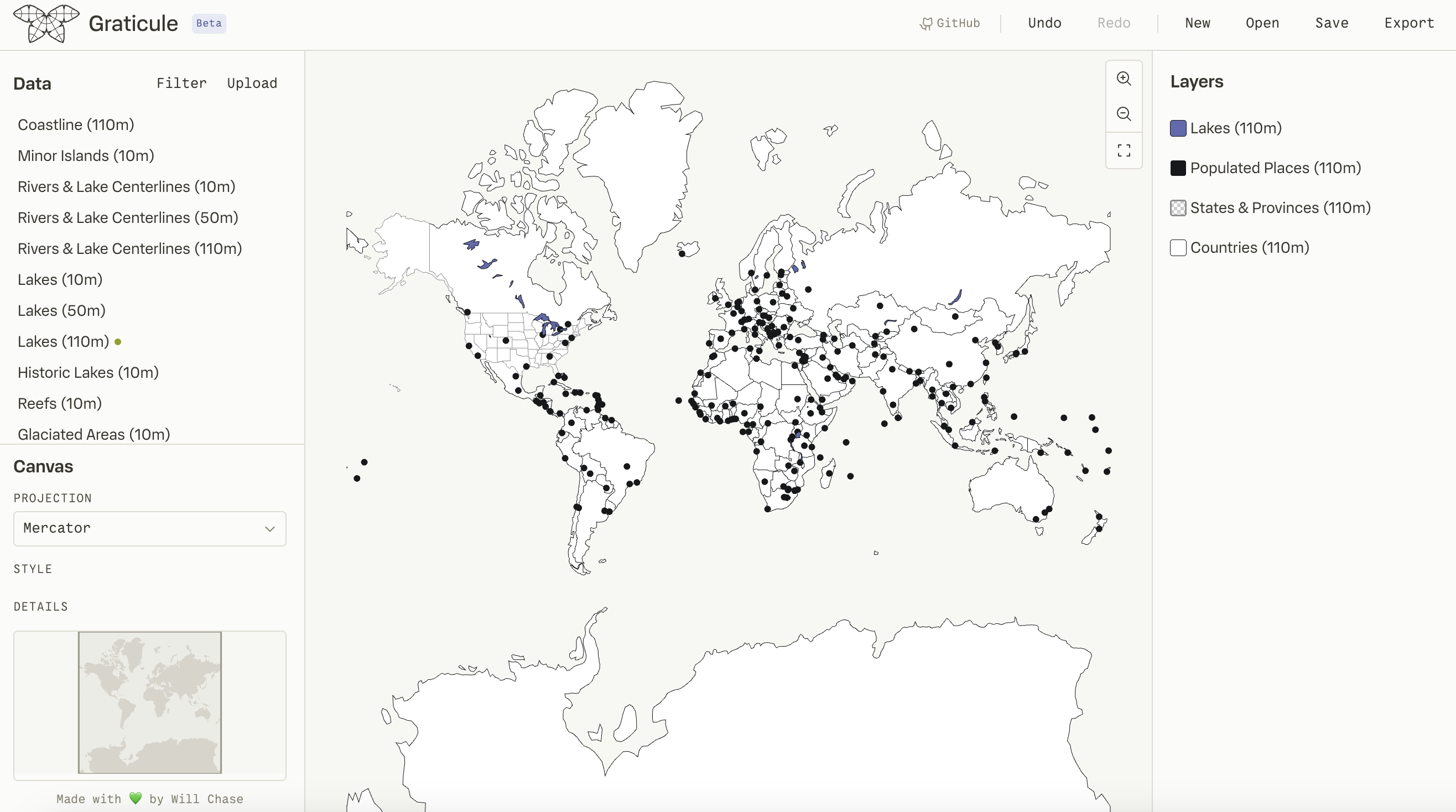
Graticule already has a layers panel where you can style a layer, or adjust simplification parameters. But since a layer is formed of individual features, and someone could reasonably want to change something about an individual feature, you could imagine a UI in which features are similarly listed in the layers panel, perhaps as a level of hierarchy underneath the layer which you can expand, much like objects within a frame in Figma. But, this concept doesn’t map as nicely to GIS software as it does to design software.
- For one, a layer is often made up of many hundreds of features, simply being able to scroll and find the one you want is a challenge in a layers panel.
- More importantly, it’s common and convenient to apply styles and formatting to a layer, so what would happen if you then have features within that layer where you’ve overridden these settings? If you go back and change the layer styling, would it warn you that this will only apply to certain features? Now you have to manage the styling and settings of many hierarchical nested objects, it becomes cumbersome and confusing.
So, I decided that we would focus the bulk of the work on layers, and just make it easy to “pop out” a feature to its own layer. This way, if you want to style one U.S. State differently than the rest, you can just select that feature, extract it to a new layer, and treat it as you would any other layer, and in this way you’re easily able to track all the visual objects on your canvas within the layers panel as equal siblings.
Intentional use or Wild-West?
For all that I love about it, one of my biggest frustrations with Mapbox is the inability to directly select a layer on the canvas. You can only interact with layers by selecting them in the layers panel, which creates a lot of disconnect. Like most people, I’m bad at layer hygiene—I frequently end up with 6 layers all called “labels (copy)“. So figuring out which one I want to select when I can only interact with the layers panel is a nightmare. And this is exacerbated by the fact that there’s no visual feedback on the canvas when a layer is selected, so the only way to know if you’ve clicked the right thing is to change its style and see if the canvas changes.
I knew from the start that I wanted users to be able to interact with features directly on the canvas. This was a key principle I used when designing Observable Canvases—you see your data rendered on the canvas, so you should be able to just point at it and interact with it, rather than having to move your attention to some other place in the UI and maintain a mental link between the visual representation on the canvas and the visual representation in the UI.
But this presents a few challenges:
- Currently, users navigate the canvas by panning, and this is a very common action to move around the map as you zoom in on different areas.
- Panning is a click-and-drag event, so if selection was always active, panning would interfere with marquee selection.
- In many other infinite canvas programs “selection mode”, where you can interact with objects on the canvas, is the primary mode and it doesn’t interfere too much with navigation because you primarily navigate by scrolling, not by panning. But this scroll-based navigation is less common in GIS applications, particularly because it doesn’t feel natural with projections like Globe or Conic, which require controlling rotation.
- Also, the “always on” interaction mode means you get a lot of visual noise as you hover across a feature-dense layer, and it raises the chances for accidental interaction. In infinite canvas programs, this is less of an issue because you often have a lot of blank canvas where it’s easy to click to clear your selection. But on a map, the entire canvas is often flooded with objects, since they interlock like a puzzle, meaning there’s less empty space to easily click away.
So, I decided we’d have a separate mode for naviation (panning) and selection. Although I craved the simplicity of a single mode, this concession felt necessary to bring more intentionality to the UX, and it was likely to happen anyways in the future as we introduce more capability like drawing, which would certainly necessitate a dedicated mode.
As predicted by our fission metaphor, this raises more questions than it answers:
- How will users swap between the modes? → A floating toolbar on the canvas
- If users select an object then switch to pan mode, will it keep displaying their selection? → Probably, yes
- While in selection mode, how can we let a user quickly navigate a bit to find their next desired object without having to entirely swap modes? → Holding space bar while in selection mode temporarily actives panning
- The layers panel still exists in pan mode, and we don’t want to restrict all actions besides navigation to selection mode - eg: someone should still be able to change the color of a layer while in pan mode. But where do we draw the line? Can you “select” a layer in pan mode by using the layers panel? Can you just style it, or can you also do operations like dissolve and clip? How much visual feedback on the canvas do we retain in this mode? → ??????
As you can see, I don’t have all the answers yet, we’ll get into that in another post.
Features on features on features
Returning to our fission metaphor, we’ve now explored where this chain reaction could lead us, the way forward may not be entirely clear, but at least we understand where it could lead.
It may seem like unnecessary overwork to pull on a thread like this and spend so much time designing for features that are 10 steps down the road. Indeed, I’ve had this conversation many times with folks who wanted to just start and see where it leads us, knowing that we’ll probably change our minds along the way. But this sort of “desiging ahead” work is critical for de-risking: it prevents you from painting yourself into a corner. It ensures that you’ve explored the possible pathways a feature could take, and that decisions you make today won’t bite you in the ass tomorrow. It doesn’t set a path in stone, we still have many unknowns and we will surely change things as we get into the implementation, but it means we have a map to follow: we know the terrain, we know the landmarks to look for, we where the forks in the road exist, and we know which ravines are crossable and what sorts of bridges we might need to build to get there.
After all this planning, here’s what our map looks like:
A floating toolbar that allows users to swap between pan mode and selection mode
- Panning mode is primarily for navigation, while selection mode is primarily for interacting with features.
There is a concordance between the canvas and the layers panel that we need to establish and keep in mind throughout - as a user selects a layer on the canvas, that feedback should be reflected in the layers panel, and vice versa
Layers are made up of features, implying a nested relationship.
- It is important that users can understand this relationship (ie. if a feature is selected, it should be clear which layer it belongs to), but we also want to separate where the work happens and imply that the majority of operations happen on layers.
As a user is interacting, they will need feedback to tell which layer or which feature they’re looking at.
- Layers can use the layers panel for some of this, but in the case of features, we don’t have a location yet - this implies we’ll need a tooltip or panel or something to display information about selected and hovered features.
Although we decided not to list all features of a layer within the layers panel, we do need some location where people can scroll through every feature in a layer and inspect its properties.
- A Feature Table (a common fixture of GIS software) is the natural place for this, TBD on exactly where it goes or how to access it though.
Once a feature or layer is selected, we need some UI that enables the actual operations you can do on it, like dissolve, extract, or delete.
- Claude suggested a popover or extra side panel for this, but I think that feels quite heavy, my instinct is to put them in a smaller dynamic action bar that would appear above the floating canvas toolbar (where you swap between the pan and select tools). It feels like a natural location and I think we can fit any UI we need into dynamic elements, rather than a big fixed panel.
I’m planning to sequence the work like this: pan/select mode toolbar → feature selection on canvas → feature feedback tooltip → feature actions via dynamic toolbar → feature table → layer selection → layer actions via dynamic toolbar.
This might seem a bit backwards: if layers are the primary unit of work, shouldn’t we focus on them first? But we already have a concept of layers, I want to get at least a bare bones version of features in place and then see how it interacts with layers. When you have a big feature like this with many pieces that will all interact with each other, I prefer to get all of the puzzle pieces on the board first, and then figure out how they’ll fit together.